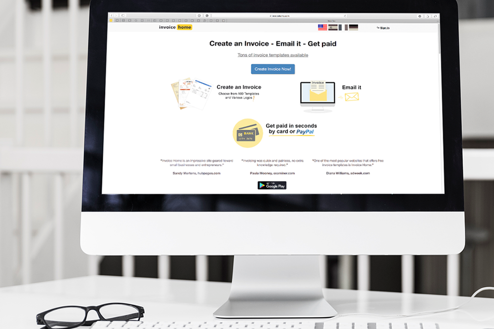
Invoice Home is a freelance invoice tool that helps you create invoices using over 100 templates and get paid as a freelancer.
In this Invoice Home review, I’ll explore the overall ease-of-use, design, UX, functionality, and product offering to help you determine if it’s worth using this free invoicing tool.
Most importantly, I’ll answer: should you use Invoice Home to send invoices? Or should you choose something else?

Get Weekly Freelance Gigs via Email
Enter your freelancing address and we'll send you a FREE curated list of freelance jobs in your top category every week.
To start, I’ll summarize my findings below and compare Invoice Home with other invoicing tools you may be debating between.
| Invoice Home | Moxie | Freshbooks | Quickbooks | Bonsai | |
|---|---|---|---|---|---|
| Ease-Of-Use | Very simple and easy to use. But outdated design features can be slightly confusing. | A bit more onboarding compared to Invoice Home. Definitely more time to setup before sending your first invoice. | Also very easy-to-use, but requires a bit more of an onboarding. Free invoice templates if you want to skip login. | Quickbooks is built for people with accounting know-how. It takes some training to know how to use it. | Easy to use and understand the basic functionality of sending an invoice. |
| Design & UX | The invoice creator (and many of the templates) look like their straight out of the 90s. | Design and UX are unparalleled. Well-thought-out and modern. | Modern, but with a touch of old-school style. This tool has been around for a while. | Again, Quickbooks is built for accountants and finance people. UX is not their top priority. | Recently updated design and UX makes it a clean and crisp experience. |
| Functionality | Works well for what it is, but lacks a few basic features such as adding discounts. | Everything functions flawlessly and looks good doing it. | There’s a stable predictability to this Freshbooks that is obvious as you use it. | Everything works well, but is a bit cumbersome to use—particularly in the reports. | No issues when trying to send invoices or use any of their other tools for freelancers. |
| Features | Auto Numbering, Logos, Online Payment Processing, Unlimited Storage, Connect Payment Gateways | Not only invoicing features, but proposals, contracts, time-tracking and lots more. | Invoicing features pair well with all other small business finance features. | Another feature-rich option for an all-in-one solution. | Everything feels a bit “light”—meaning, if you’re more than just a solo freelancer, you may find it lacking. |
| Learn More | Learn More or read our Hectic review | Learn More or compare Freshbooks vs Quickbooks | Learn More or see Quickbooks Alternatives | Learn More or read our Bonsai Review |
First impression of Invoice Home
To give Invoice Home the most fair assessment possible, I didn’t read any articles or reviews before logging on, signing up and giving it a try myself.
At first blush, Invoice Home is a simple, easy-to-use free invoice generator.
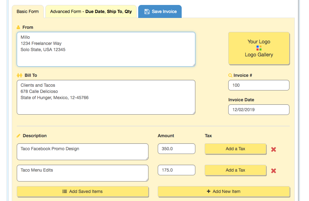
It’s basic (in a good way) but also offers a few advanced features. I like how, after signing in, I wasn’t taken to some elaborate onboarding sequence like I have been with invoice tools, but instead I was taken directly to the “create an invoice” screen.
All filled out (which only took me about 60 seconds) it looked something like this:
Of course, you might be guessing what my primary complaint is about Invoice Home at this point:
Its design is terribly outdated. When you compare it with some of the most popular freelancer invoicing apps, it feels less slick and more like something designed a decade or more ago.
Still, the design itself isn’t necessarily hard to use and its simplicity makes for quick invoice generating.
So if you can get over the older UX style, it’s a good free invoice generator option.
Overall functionality of Invoice Home
Once I created my first invoice, I started to tinker a bit more with the overall functionality of Invoice Home.
Generally, it’s quite simple to understand and there were no real hiccups along the way.
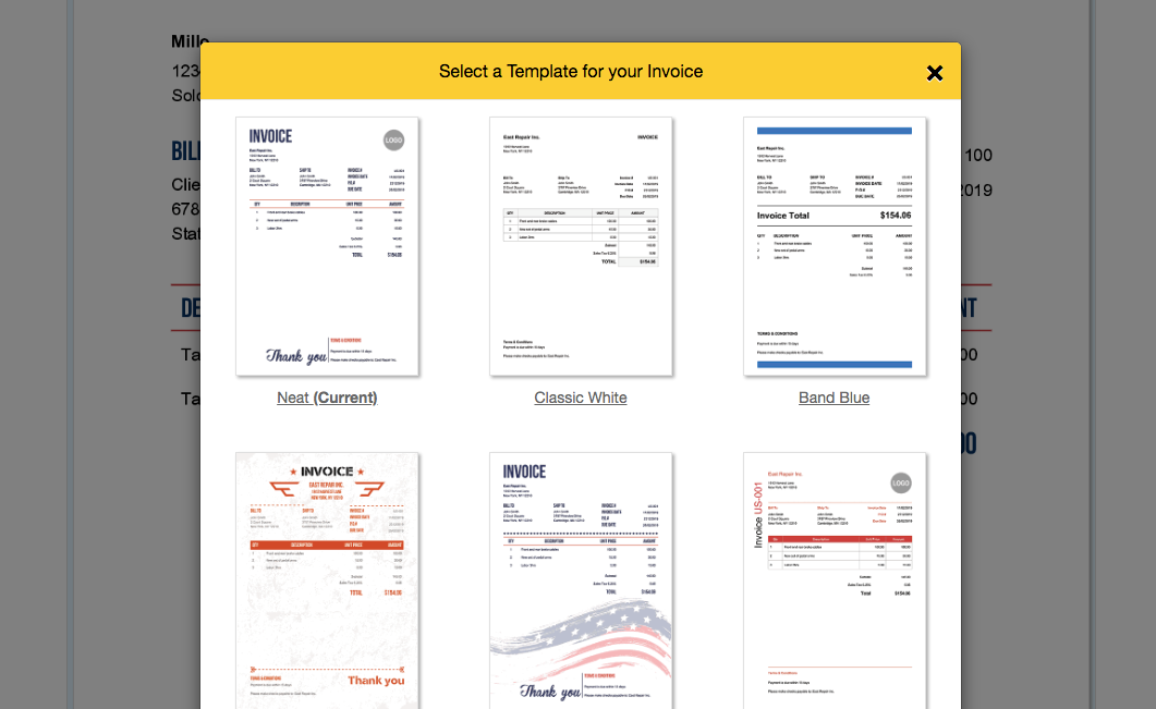
After populating my invoice details, I was able to pick a template (see below). This was a unique and refreshing option I hadn’t seen in many other invoice generators so I appreciated the extra effort there.

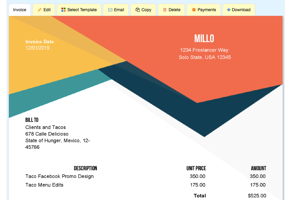
Just for fun, here’s the design I ultimately landed on (I also must have been hungry when writing up this invoice):
It was also extremely easy to download the invoice as a PDF directly from the preview page.
Alternately, there’s an option to send via email right from the app itself. I also appreciated the fact that I could attach additional files to the email (something not many other invoice generators offer) before sending.
Where Invoice Home shines
As far as functionality goes, it offers the most critical pieces any freelancer may need including:
Document templates
Multiple templates like invoice, proposal, estimate, purchase order, receipt, etc. make it easy for you to store all of your client-facing business documents in one place.
Saving previous list items
The ability to save previous items is helpful for faster invoice generation. For example, if you’re always charging a client the same cost for an article once a week, just select the saved item for your list and send the invoice. It’s super quick.

Availability on any device
The fact that there’s both an Android and iPhone app for Invoice Home means you can access Invoice Home on any device with the same functionality. Extremely helpful for a freelancer who’s on-the-go all the time.
Helpful Reports
Finally, the reports tab has some definite potential for tracking how much you’ve billed and how much revenue you still have outstanding—important metrics to run your freelance business by.
Where Invoice Home can improve
I’d be dishonest if I didn’t address a few of its shortcomings in terms of functionality, though:
Limited functionality
From what I can see, Invoice Home doesn’t do much that PayPal, for example, won’t do. But, on the upside it’s free and doesn’t take a fee when an invoice is processed (up to $1,000 in invoices) like PayPal does.
Outdated design
I don’t need to kick a dead horse here, but if design and aesthetic are important to you, this is going to be a critical point for you. Yes, it works well. But it doesn’t necessarily look good getting the job done. Using something like Zintego Free Invoice Generator would give a much more modern look not only to the interface, but to your invoices too.

“Tabbing” all mixed up
If you’re more of a “tabber” than a “clicker” like I am (meaning you press the tab button to get to the next field on a computer instead of using your mouse) you might find it a bit frustrating since you can’t just tab to the next field when filling out your invoice.
Difficult to find more advanced fields
Lastly, I had a harder time finding a few key ingredients I recommend when learning how to create an invoice such as an option for payment terms (net 30, etc.) The features are there, but I think they could be a bit more obvious.
Final thoughts on Invoice Home
Here’s the short of it: if you’re looking for an easy-to-use free invoice generator, then you should try Invoice Home. You’ve really got nothing to lose.
This is especially true if you’re early in your business and just getting started with clients.
But if you’re in need of a more advanced tool, with more robust features and an exceptional UX design, you may want to consider another option.
Keep the conversation going...
Over 10,000 of us are having daily conversations over in our free Facebook group and we'd love to see you there. Join us!


