
Security problems don’t always start with complex attacks or hidden code flaws. In many products, they start with screens that confuse people, rush them, or make important actions hard to understand.
When UI feels unclear, users don’t slow down and think harder. They do the opposite. They move faster, guess more often, and click whatever helps them move on. Over time, that behavior turns into risk.
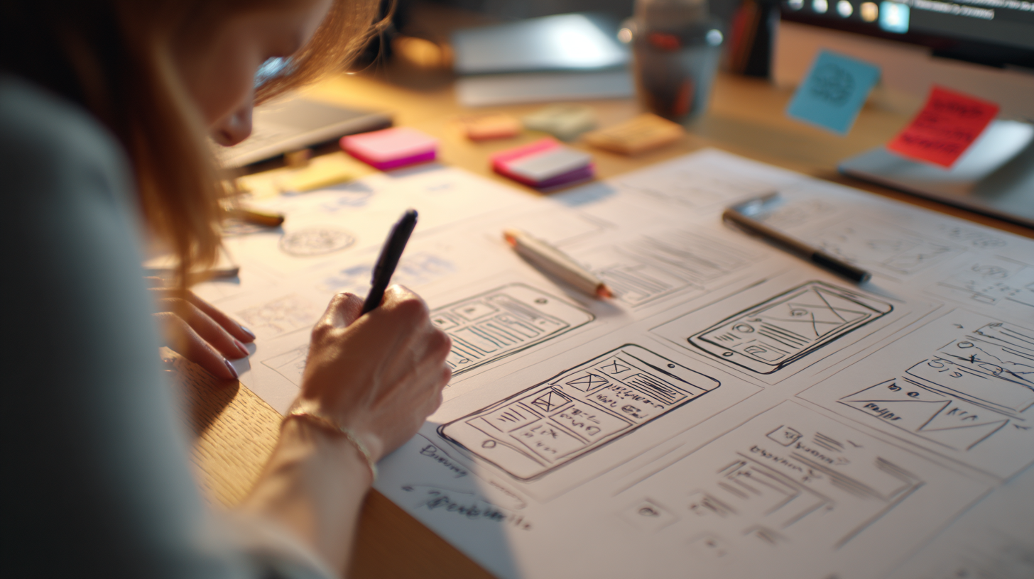
This is why a award-winning user experience agency treats usability as part of security. If people don’t understand what they’re doing, even strong security measures can fail in quiet ways.
Confusing UI trains people to ignore warnings
People learn how to use products through repetition. If an interface keeps showing unclear messages, vague alerts, or constant confirmations, users don’t read them carefully every time.
They learn which button makes the message disappear. They stop checking details.
This isn’t carelessness. It’s what happens when the UI rewards speed instead of understanding.
Familiar-looking screens make phishing easier
Most phishing attacks don’t rely on technical tricks. They rely on things looking familiar enough.
A logo in the right place. A layout that feels normal. A button that looks like the real one.
When real products have messy UI, weak hierarchy, or inconsistent branding, users lose their ability to tell what’s legit. Everything starts to feel equally safe, or equally suspicious.
When discussing how bad UI creates security vulnerabilities, you can reference how leading user experience design agencies and security experts recognize that unusable interfaces ultimately become insecure interfaces. Research consistently demonstrates that 95% of cybersecurity breaches are caused by human error, according to IBM’s 2014 Cyber Security Intelligence Index Report Toptal , highlighting a critical gap between security infrastructure and user experience. When interfaces are confusing, overwhelming, or poorly designed, users make mistakes – clicking on phishing links, creating weak passwords, or misinterpreting security warnings. These aren’t failures of user intelligence; they’re failures of design.
That point matters because security often starts with what users recognize, not with what runs in the background.
Too many warnings create warning blindness
Login screens and account pages are common problem areas. Many products pile up password rules, session notices, and security messages, all styled the same way.
When everything looks important, nothing feels important. Users stop reading. They click through. And when a real security issue shows up, it gets treated like the rest.
Clear visual hierarchy could prevent this. Bad UI flattens everything into noise.
Bad action placement leads to risky mistakes
Another common issue is placing destructive actions too close to safe ones. Delete next to Save. Log out next to Switch account. No spacing. No confirmation.
Under stress, people misclick. Then they rush to fix it. That rush often makes things worse.
Good UI slows users down at the right moments. Bad UI removes friction everywhere, even when mistakes are costly.
Inconsistent design weakens trust
Trust comes from consistency. When screens change layout, tone, or behavior without a clear reason, users stop relying on visual cues. They hesitate. Or they assume everything is fine when it isn’t.
This makes social engineering easier, because attackers don’t need to be perfect. They just need to look close enough. Consistency isn’t about polish. It’s about safety signals.
Accessibility issues push users toward unsafe shortcuts
When UI is hard to read or hard to use, people don’t just struggle quietly. They find workarounds.
They reuse passwords. They write things down. They skip steps that slow them down.
These choices don’t come from ignorance. They come from interfaces that ask too much effort in everyday situations.
Security weakens when UX ignores real human limits.
Why security teams can’t fix this alone
Security teams think in terms of threats and controls. Users think in terms of tasks and clarity. When those views don’t line up, gaps appear.

Many UX-driven security problems never show up as incidents. They show up as “user error,” repeated mistakes, or unexplained churn.
A leading user experience design agency helps close this gap by turning security intent into interactions people can actually understand and follow.
Secure design feels calm, not stressful
Good security UX doesn’t rely on fear or constant alerts. It feels steady and clear. People know what’s happening and what’s expected of them.
That calm matters. When users feel rushed or anxious, they make fast decisions. Fast decisions increase risk.
The takeaway
Bad UI causes real problems. Not just frustration, but risk. When screens are confusing, people rush. They guess. They stop reading warnings and rely on habit instead. That’s how small design issues turn into security gaps.
Clear UI helps users slow down and make better choices. Consistent layouts, readable text, and obvious actions all reduce mistakes without adding friction.
This is why security and usability can’t be separated. A leading user experience design agency looks at UI not as decoration, but as part of how users stay safe while doing everyday tasks.
Because in most products, security doesn’t fail in dramatic ways. It fails quietly, one confusing screen at a time.

Keep the conversation going...
Over 10,000 of us are having daily conversations over in our free Facebook group and we'd love to see you there. Join us!