

Your design portfolio speaks for you long before an interview with a potential client or employer. And unlike an interview, people can make up their mind and exit out within seconds of landing on your site.
I review dozens of portfolios every week thanks to Semplice, a portfolio system I work on for designers. And I’ve learned what makes a portfolio stand out, and what makes me exit fast.
Here are portfolio mistakes that could be standing in the way of you and your next design job.
👋 Psst...Have you seen the all-new Feedcoyote yet? They've got a new look, more freelance opportunities, and the best collaboration tool for freelancers! Join over 100,000 fellow freelancers who network, find clients, and grow their business with Feedcoyote. Join for Free »
1. The generic, bullsh*t intro
If we read that you “craft visual stories for brands and disrupt the marketplace with authentic design thinking” we will be asleep two words in, and have no idea what you actually do.
Don’t stuff your introduction with buzz words or cutesy creative language. Just tell us plain and simple who you are and what you do. Showing personality in your portfolio is good — writing like a trendy designer robot is not.
HOW TO DO IT RIGHT
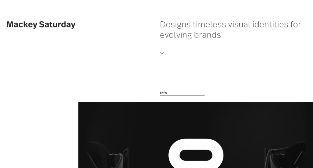
Take Mackey Saturday’s portfolio for example. While Mackey does brilliant work for big clients, he’s not bragging or trying to impress with fancy buzzwords. His introduction is polished but straightforward, allowing you understand at a glance what he has to offer.
2. Filler projects
We all have those projects: The ones at the bottom of the list, the work that’s fine but nothing stellar, just there to fill the page. Remove these projects from your portfolio. Your portfolio should only include the work that makes you proud, even if that makes it feel a bit emptier. If you present it in the right way, even a small amount of projects will make an impression.
HOW TO DO IT RIGHT
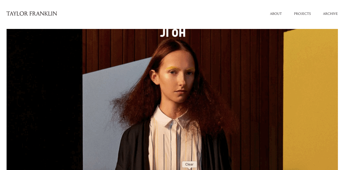
Check out Taylor Franklin’s portfolio. She only includes ten or so projects, but her portfolio doesn’t seem empty or incomplete. Instead it feels confident, each project filling the screen as you scroll. Instead of cluttering her portfolio with fluff, Taylor boldly shares her best work.
3. Over-animation
Animation or motion effects can bring life to our projects and give our portfolio more dimension. But often it crosses over into 90s Powerpoint territory, with tricks and transitions just for the sake of them.
Too much animation not only confuses and frustrates your visitors, but distracts from your work. Many of your visitors will just want to scroll through your projects to see what interests them – don’t make it hard for them to do so.

HOW TO DO IT RIGHT
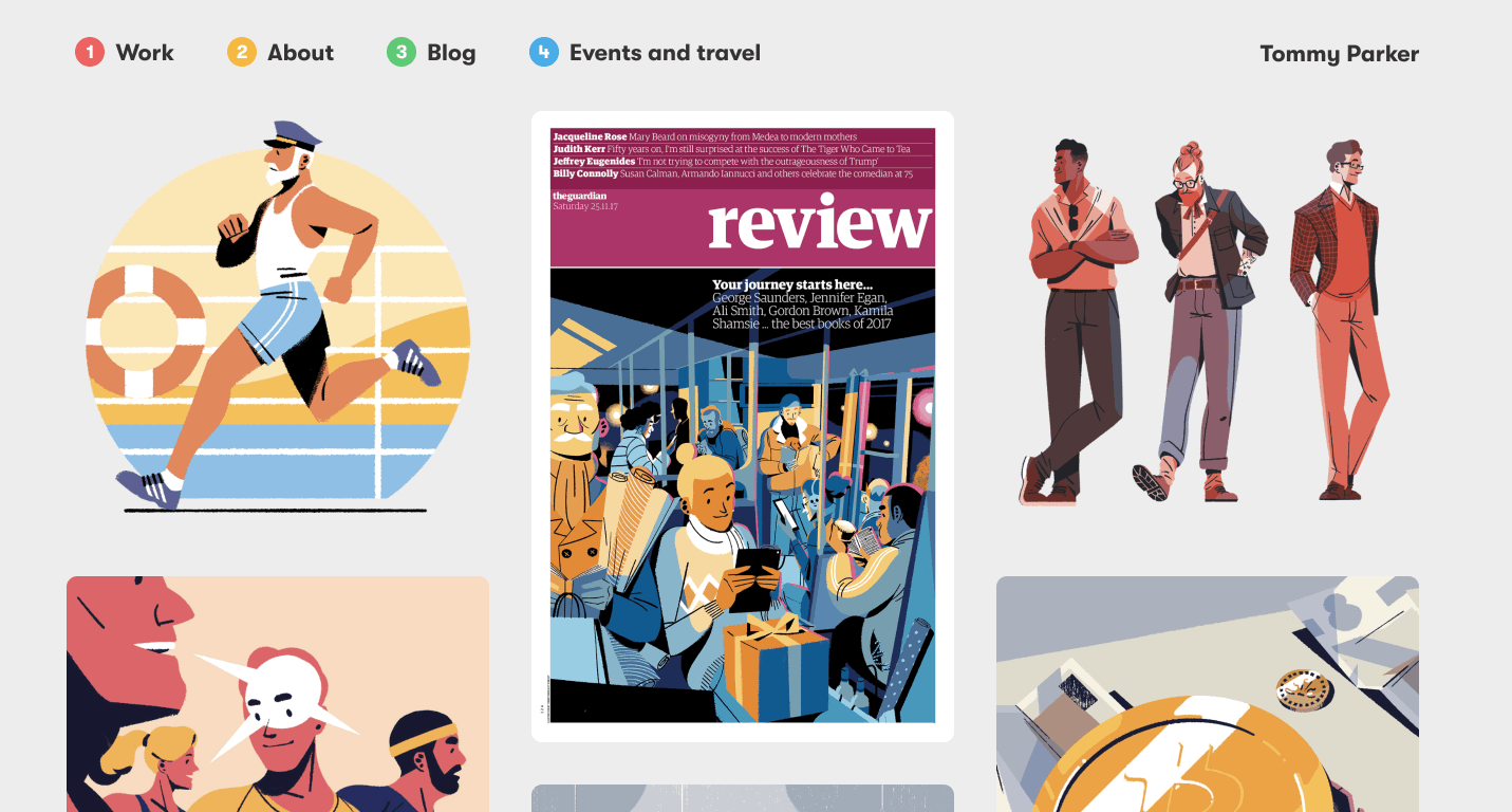
Take a look at Tommy Parker’s portfolio. He uses snappy page transitions that make a beat of loading time more enjoyable. It’s a nice little surprise that elevates his work without getting in the way of it.
4. Redundant pages & confusing navigation
When I see a navigation that includes CONTACT, ABOUT, PORTFOLIO and ARCHIVE, I feel uncertain where to start. Can I contact you on your About page? Should I read about you first? And what is Archive, just a bunch of old projects you’re still attached to?
Think about your visitor when building your portfolio. Chances are, they’ve viewed dozens of portfolios today already and don’t have much time to find their way around yours. Guide them straight to the work you want them to see and condense some of your content if it makes sense.
For example, contact information could easily be placed on your About page if it’s just an email address and a couple social links.
HOW TO DO IT RIGHT
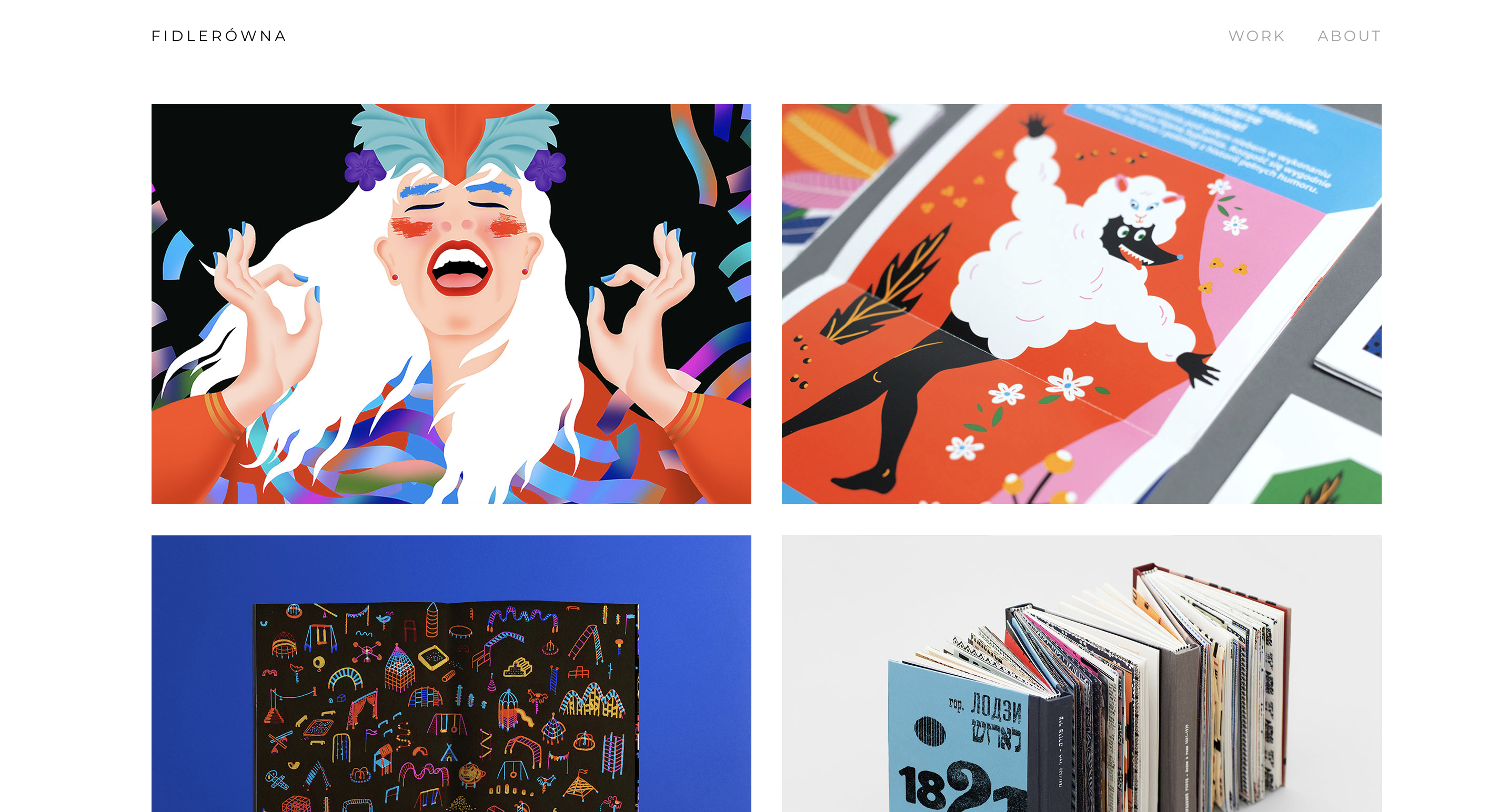
Joasia Fidler-Wieruszewska’s portfolio includes two navigation items: Work and About. What else do we need to know? It’s all right there on two easy pages.
5. Unsolicited Fortune 500 redesigns
If you’re early in your career, unsolicited designs or personal projects can be a great way to show what you can do, or what you want to do. But if you have too many unsolicited redesigns for big companies like Nike or Ikea in your portfolio, you’re not doing yourself any favors.
Those companies already have great assets and an established brand. It doesn’t show much skill or vision by designing something just like something else they’ve already created.
HOW TO DO IT RIGHT
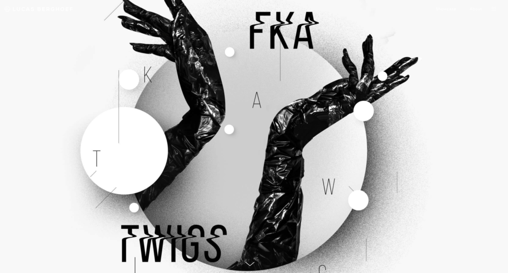
In Lucas Berghoef’s portfolio, he shares a visual identity he created for the UK artist FKA Twigs. It’s an unsolicited design he did for school, but it doesn’t seem that way scrolling through the case study. He took a fresh perspective inspired by the artist, rather than pulling pre-existing assets from a commercially recognized brand.
Concluding thoughts
As designers we know best practices and how to design for our users. Yet what we tell our clients is easily forgotten when it comes to our personal work.

Sometimes, we’re just too close to our portfolio to see clearly. Reevaluate your portfolio and remove these hangups, and you’ll be well on your way to the work you want to be doing.
Keep the conversation going...
Over 10,000 of us are having daily conversations over in our free Facebook group and we'd love to see you there. Join us!


It’s a nice surprise to see Tobias at Millo!
Great post and precious advice.
Thanks a bunch for this post Tobias…exactly what I needed to read at the moment as I’m trying to redirect my design business. I really loved the comment about stripping back the menu…something that I’m going to try on my site 🙂
Thanks again!
Hi, Tobias! I completely agree. Use the cream of the crop — don’t water your portfolio down with the so-so pieces. Quality over quantity is definitely the way to go. It’s making me want to go weed out some portfolio pieces on my own website… 🙂