Business cards are kind of bland, but aren’t they supposed to be that way? Even Graphic design business cards?
I mean, what is a business card, really? It’s a piece of cardstock that tells other people your name, business name, address, social media, and other important information.
The keyword in that last sentence? Important. Business cards are very, very important, especially for graphic designers. Whenever you give away your business card, you’re showing your potential clients your graphic design chops.
👋 Psst...Have you seen the all-new Feedcoyote yet? They've got a new look, more freelance opportunities, and the best collaboration tool for freelancers! Join over 100,000 fellow freelancers who network, find clients, and grow their business with Feedcoyote. Join for Free »
If your card is featureless, black text on a white background, what does that say to customers? It says you aren’t a very good graphic designer. Sorry, but the truth hurts.
Graphic designers should treat their business cards like tiny resumes. Mediocrity doesn’t help here, so it’s essential that you make a stunning card that screams, “I’m the right designer!”
In this article, we’ll show you first some amazing inspiration, then cover what you’ll need to include and how to stand out.
10 gorgeous graphic design business cards you have to see
There are hundreds of incredibly cool designs you can draw inspiration from, but we think the following freelance graphic design business cards are some of the best on the internet.
1. Add a splash (or a gallon) of color
There are hundreds of graphic artists competing for work, so don’t be afraid to stand out. You don’t have to yell from the rooftops to get business, but you may need something just as loud.
Remember, you want your business card to scream at your clients because you can’t whip out your portfolio in some settings. The best way to do this? Use a color other than black or white.
The fundamental rule of graphic design business cards is to be anti-bland. So, don’t settle for a white background; kick it up with a whole lot of neons, pastels, and contrasting colors.
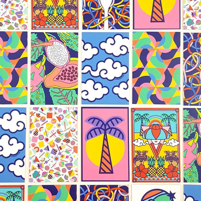
Lina, a freelance illustrator and designer, uses their own designs as business cards. These cards are effective because they tell the client exactly what to expect. Her bold illustrations are as dynamic as her personality, which isn’t just good for brand design; it’s great marketing!

2. Dip your real and virtual brushes in paint
Not all graphic artists are interested in visual arts, but that’s probably how you got your start. If you’re a fan of painting, consider creating your own masterpiece for your own business cards.
You can get more depth in your painting if you use actual paint, but you aren’t limited to a physical brush. There are plenty of watercolor brush sets you can buy or tools you can use.
For example, the BeFunky paint editor can change regular photographs into fluid watercolor, textured oil, and impressionist paintings with one click. But, don’t tell your clients that!
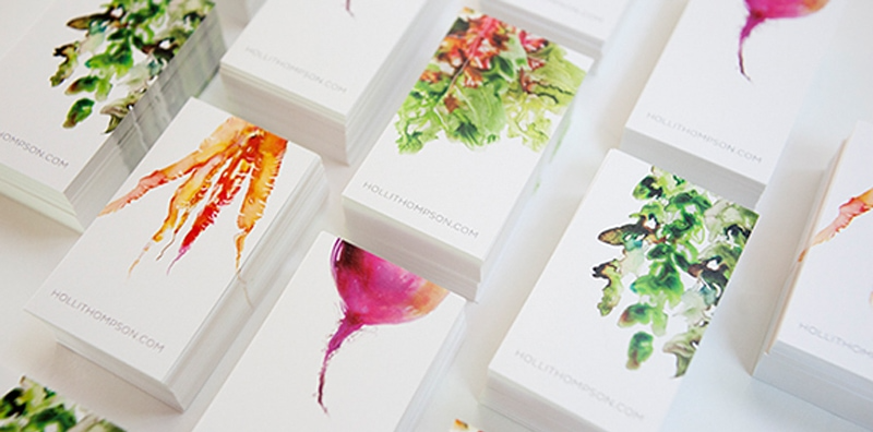
Credit: Holi Thompson
Holi Thompson, health guru and nutrition coach commissioned Marta Spendowska to create these incredible watercolor business cards. The vibrant, red beat is featured on her website. While Holi Thompson isn’t a designer, you could use cards like these to show off your art.
3. Don’t settle on one graphic design business card
Graphic designers are creative people, so it’s going to be hard to settle on one design. Do you have to choose one business card for all of your clients? No, and it’s better if you don’t.
Both Holi Thompson and Lina didn’t settle on one design. Instead, they created a selection of cards for variety. But, you can use this concept to ignite the collector’s spirit in your clients.
For example, you can make 20 different business cards, each with a number of letters on the back. When combined together, the client gets 20% off their next purchase or project.
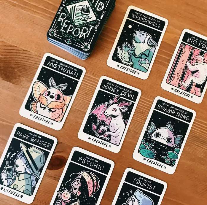
Credit: Mai Nguyen
Californian illustrator and product designer Mai Nguyen created this pack of cards to give to their partner. While the intention wasn’t to turn them into business cards, that doesn’t mean you can’t! If you want to make your cards a useful work of art, consider creating a collection.

4. Show your client’s what you’re all about
Every designer has a specialty; what’s yours? Is it branding, illustrations, typography, or poster design? Whatever you’re best at, you can display it on your graphic design business card.
What if you don’t want to go too specific? That’s okay, too. Some designers prefer to cast a wide net by muting their colors and branding. Maybe a bright card isn’t the right solution for you.
Either way, your card has to show your clients what you’re about. Sometimes the most beautifully designed cards are simple, use little to no design elements, and are easy to print.
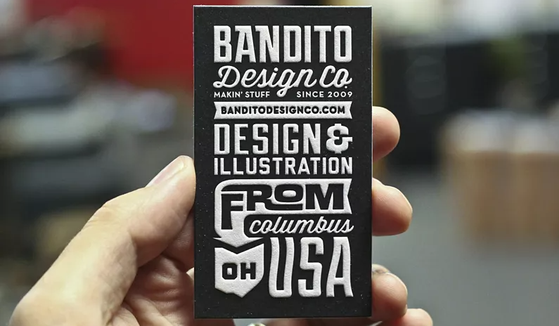
Credit: Ryan Brinkerhoff
Ryan Brinkerhoff is one of those designers that love to solve problems in creative ways. His business card is simple and not very colorful, but you can instantly tell he’ll design a mean poster. Why? Because all of the information you need is attractively displayed on a tiny card!
5. Raise your drink for coaster business cards
Not all business cards can fit inside a wallet, but we think that’s a good thing. In fact, some are better displayed on coffee tables. Enter the coaster business card, a truly memorable concept.
Think about it. Every time a potential client goes for a sip of their drink, they’ll see your name. If your design starts to warp from liquid stains or spills, they’ll look you up for another one.
Now that you’ve got their attention, you’re one step closer to opening their wallets. While they’re looking to refill their coasters, they’ll explore your shop and potentially hire you for a project.
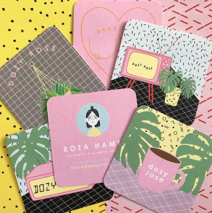
Credit: Dozy Rose
Roza Hamta of Dozy Rose went above and beyond with her playful, vapourware aesthetic that’s right up the Millennial alley. Her business cards give her more space to express herself and show off her work. That gives clients the impression that she’ll make any webpage eye-catching.
6. Go beyond the limitations of cardstock
The problem with cardstock is it’s bendy and susceptible to environmental damage. There’s nothing sadder than seeing a lone business card floating in a puddle, ripped up and soggy.

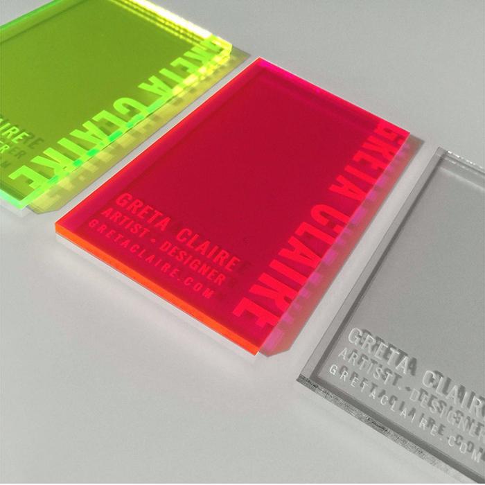
If you want your graphic design business cards to withstand the test of time, use clear or thick plastic business cards. But if you want to be environmentally friendly, try wood or bamboo.
While taking the non-conventional route will come at a price (literally, these cards will be expensive to print), your graphic design business card will stand out from the competition.
Greta Clarie is a contemporary abstract artist and designer from Minneapolis who used her business cards in an art installation. These cards are simple, colorful, and can be displayed in your home. Greta Clarie’s cards play with light and look incredibly beautiful placed by a window.
7. Cut the small talk by cutting corners
Unique shapes are one of the easiest ways to get your business card noticed without thinking too hard about the design on the card. But don’t get us wrong, your design is still essential!
If you want to explore something a little different, consider die-cut business cards. By cutting corners, you’ll be able to display your brand as the opposite of cheap and ineffective.
In fact, you’ll be seen as creative and genre-pushing, something all designers aspire to be. With die-cuts, the options are endless, so you may want to experiment with a few shapes and sizes.
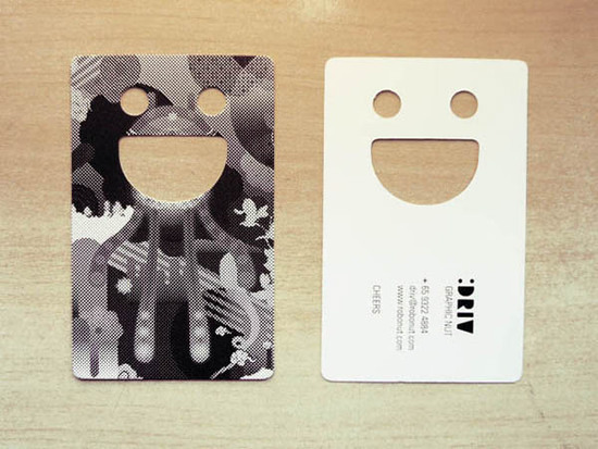
Credit: Driv Loo
Designer and art director Driv Loo took an incredibly unique approach to die-cut business cards. He incorporated his initials into the card, with the smile as the “D” in Driv and the two eyes representing the two O’s in “Loo.” What results is a super cute and endlessly brandable smiley.
8. Be fun, be educational, be creative
Business cards are just pieces of paper. Well constructed, cardstock paper, but still paper. Once your potential clients read the information on the card, it goes into the endless pocket void.
But wait, what’s this? A business card with a puzzle, a cool fact, or something the client can use? Well, I guess I won’t throw this card into a black hole. At least, that’s what we would think.
Graphic designers can get super creative here but make sure you work in your design with your contact information. You wouldn’t want to confuse or frustrate your future clients.
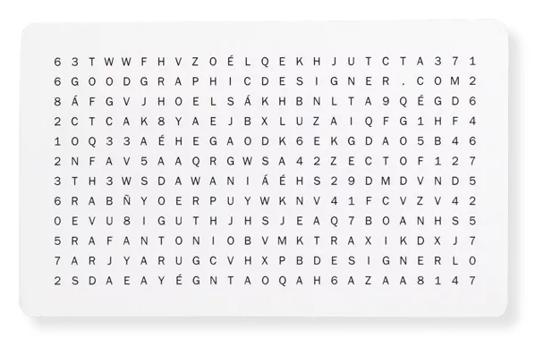
Credit: Jose Antonio Contreras
Graphic designer Jose Antonio Contreras wanted to have fun with his design by making a word search. On the back of the design, he displays his contact details and what you can expect to find in the word search. This graphic design business card is expertly executed and unique.
9. Make more than just a business card
Gorgeous is defined as beautiful, very attractive, or very pleasant. While we wouldn’t describe cardboard, for example, as pleasing, it can be used to create incredibly attractive designs.
You’ll see a great way to use cardboard below, but we wanted to showcase another design by Mais Plates. They used bendable plastic and rivets to create a flexible, posable card.
Mais Plates has more than just a business card because they’re using the medium to show the benefits of pilates. Plus, clients can have a lot of fun playing with the card when they’re bored.
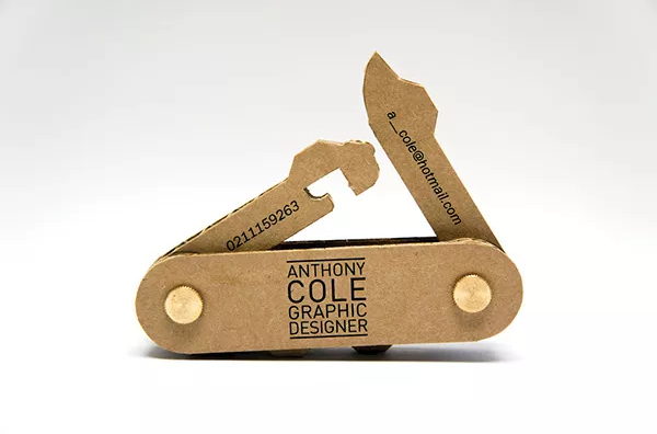
Anthony Cole, a graphic designer, said, “forget about die-cut. I’m going to make something that will knock your socks off!” And, he was right. Although there’s no way to fit this “card” in your pocket, this swiss army knife shows off the designer’s “tools of the trade” in a unique way.
10. You want aesthetics? Say no more!
Aesthetics play a big role in business. Certain aesthetics can have a long-term effect on how we view products because they strengthen the bond we have with products, services, and people.
Graphic designers know this. After all, their entire industry is based on how customers build connections with products. But designers can’t forget about their own brands in the process.
Keep in mind that your brand’s aesthetics won’t necessarily match with your design preferences, though they often do. The purpose of an aesthetic is to establish a great first impression.
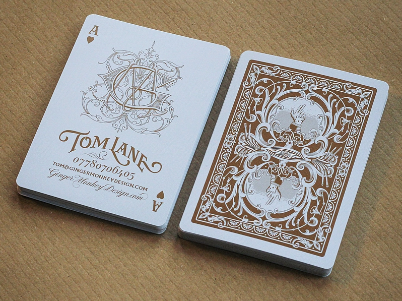
Designer Tom Lane definitely has an aesthetic and design preference that’s hard to ignore. As a huge fan of early 20th-century art, Tom Lane hit a home run with his playing card business card set. These business cards are clearly heavily inspired by the traditional Bicycle card sets.
What to put on your graphic design business cards
A business card is the next step in making your startup dreams come true. Whether you’re a freelance writer or a graphic artist, your business card represents who you are and what you do.
If your first interaction isn’t a positive one, you run the risk of losing potential clients. With that in mind, a thoughtfully designed card can’t just contain your contact information; it has to look professional, build trust in your clients, and set yourself apart from the competition.
Before starting up Photoshop, ask yourself what could bring in more business, what makes you unique, and what attributes of your graphic design business cards will sell your skills.
Here’s what design rules you should stick to if you want more graphic design clients:
- Start with a business card template
If you’re struggling to fit everything on your tiny card, consider using a template that will include key information in a pleasant way. - Stick with a typeface
Do you have a font you use on your website? The font you choose represents your brand, and so does your business card. - Include all required information
Your business card should have your name, company name, tagline, job title, website, social media, and contact details. - Organize your information
A good visual flow for business cards should start with the logo, then the name, then email, then the rest. Make sure your clients can read it. - Logo and brand colors
Have a finalized logo for your brand that you can use on your business card. Put it above your contact details or on the front side in the middle. - Leave some white space
Don’t clutter your card full of art. If there are too many things to look at, your information may get lost. Always leave a bit of white space. - Use the front for art
A graphic design business card should use the front and back of the card. Otherwise, you won’t be able to display your talents and your information. - Include a call to action
A call to action (CTA) can encourage clients to take the next step. Ask clients to join your mailing list or look you up online on your website. - Consider adding a photo
While it isn’t necessary, including a high-resolution image or a hand-drawn portrait of your face can add depth to your business card. - Proofread your card
Never print your business cards before proofreading them. You wouldn’t want to misspell your email, social media handles, or website.
These tips are all well and good, but they won’t necessarily inspire your creativity. If you want to make something that’s truly different from any business card out there, keep reading.
How to stand out with your graphic design business cards
Most business owners can get away with a simplistic, black font on a white cardstock business card. But as a graphic designer, you can’t just slap your information on a card and call it a day.
You’re competing with other artists in your industry, so if your business card isn’t up to snuff, your clients won’t have confidence in your skills. Build that confidence in your clients from the word go by including incredible design elements that leave a long-lasting impression.
To set your card apart from the rest, take a look at your competition. This may include the business cards in the next section or your direct local or online competitors in your niche.
But if you want to get started right away, use these tips to make your business card stand out:
Simplicity isn’t your friend
Graphic design business cards should pop out at your clients and leave them wanting more, so don’t make your design boring.
Experiment with texture
If you don’t like the look and feel of cardstock, consider other textures and finishes, like holographic, woodgrain, marble, linen, or watercolor.
Share a tip or a fact
Your business cards can be both informative and educational. Share a quick tip on how to edit photos or use specific brushes on Photoshop.
Make it a coupon or discount
Everyone likes free stuff, so why not offer a coupon or discount with your business card? These gifts will help your clients remember you.
Fully use both sides
While it will be more expensive than printing on one side, you should use both sides of your business card to have more space to work with.
Use complementary colors
Complementary colors are the opposite hues on a color wheel. When used together, they’ll make the graphics on your card pop.
Slap on a QR code
Instead of asking your clients to type in a URL, add a QR code on the back of your card that links them to your website or social media pages. (edited)
Try a weird shape or cut
Die-cut cards aren’t rectangular. They may not even fit in a wallet, but they’re the fastest way to make your business card stand out.
Go for useful
Speaking of weird cuts, you can cut your business card into a coaster, tool, or art piece. Useful cards are more likely to be seen/used multiple times a week.
Show off your talents
Remember to use your graphic design business cards as a mini resume. Use the space you have to quickly tell the client why they should hire you.
Where to get your graphic design business cards from
If you don’t want to design your own business cards with a design program, that’s okay! We understand you’re a busy designer, so consider using a business card printing service instead, or upload your own design to bring it to life.
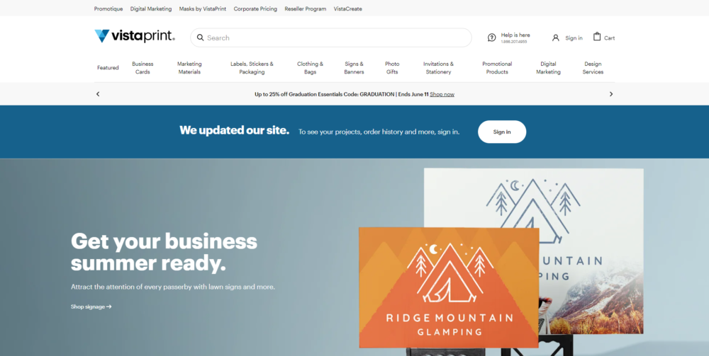
Vistaprint
Vistaprint is one of the most popular business card printing services around. Vistaprint can accommodate virtually any printing need, whether you want something classic or bold. You can choose from over 7,700 templates, tons of stock options, and hundreds of finishes and textures.
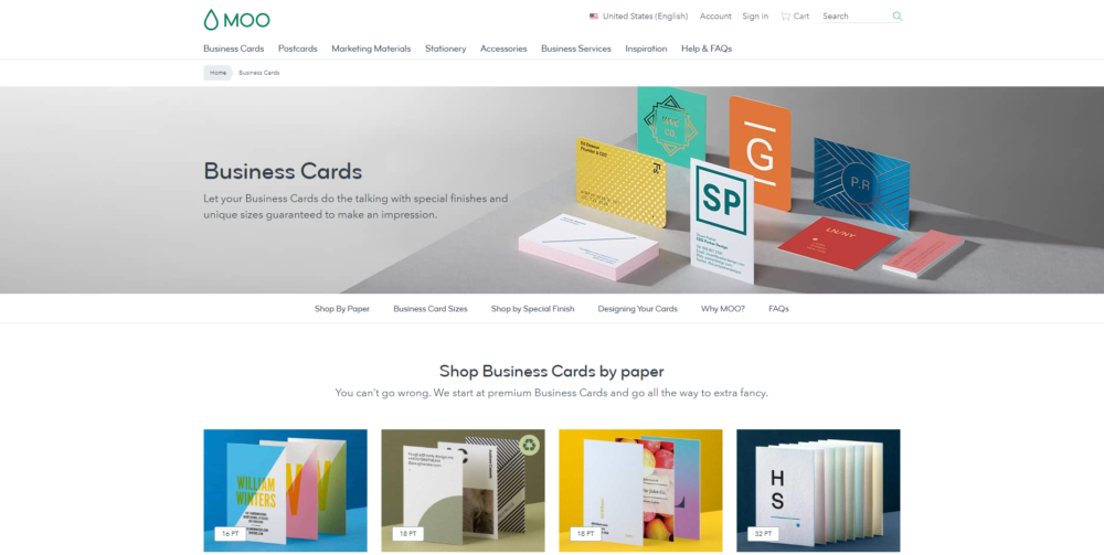
MOO
MOO is another popular option that boasts thousands of 5-star ratings on Trustpilot, and it isn’t hard to see why. Their wide range of modern options makes it easy for business owners to create custom cards. MOO offers 4 different sizes and multiple finishes, like glossy and matte.
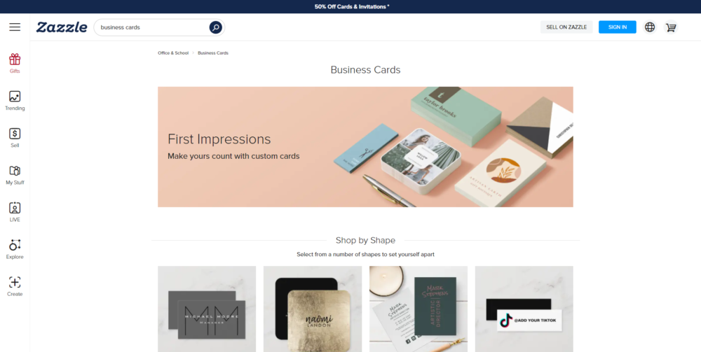
Zazzle
Zazzle is a printing company that specializes in completely customized business cards. Graphic designers who want a truly unique business card should try one of their 50,000+ templates and industry-specific designs. All templates are created by freelancers and independent designers.
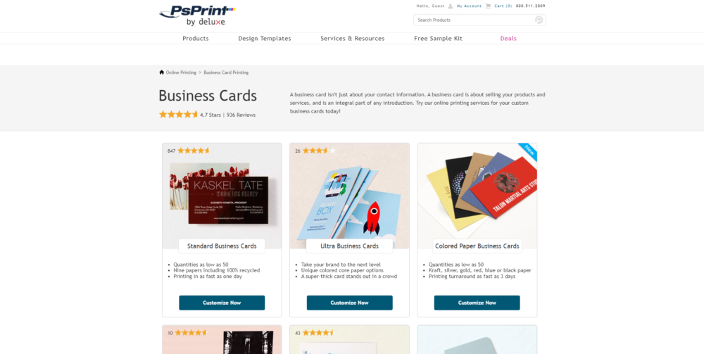
PsPrint
PsPrint is known for its die-cut business cards, which come in all kinds of shapes and sizes. Their custom cuts include curved, circle, fruit, star, heart, Rolodex, teardrop, and more. But if you want a cheaper alternative, PsPrint still sells traditional business cards at a low cost.
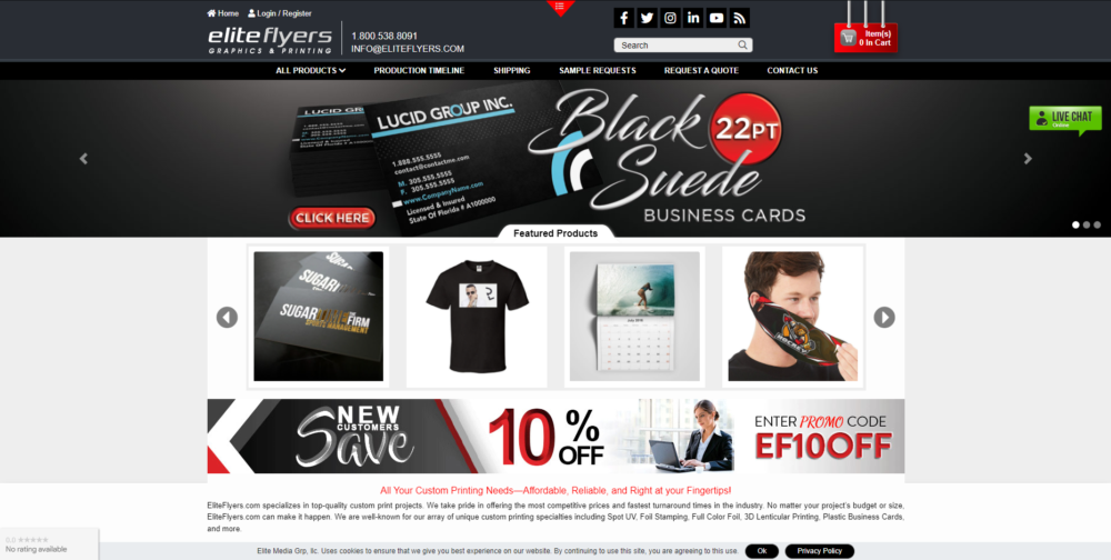
Elite Flyers
Elite Flyers is one of the best printing companies for bulk orders. You can get large orders for cheap, but keep in mind they aren’t the best when it comes to customization. Still, if you need 500 or 1,000 simple graphic design business cards right away, Elite Flyers will pull through.
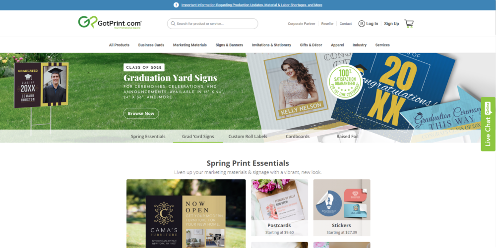
GotPrint
GotPrint has approximately 125 design templates that aren’t overly complicated, but they get the job done. You can still make an incredible business card with a bit of creativity. GotPrint offers some of the lowest prices in the printing industry, but you will have to pay for shipping.
Don’t settle for average graphic design business cards
In a competitive industry like graphics design, you’ll need something that sets you and your brand apart. Your business card can do just that. Not only will your card tell prospective clients everything they need to know about you, but it will also show off your unique personality.
By using our advice and our recommended printing companies, you’ll be able to make an incredible graphic design business card that will impress your clients and attract more business.
Keep the conversation going...
Over 10,000 of us are having daily conversations over in our free Facebook group and we'd love to see you there. Join us!


