Most freelancers build a portfolio page and then wait. People visit it, scroll through a few projects, maybe read the bio, and then leave. No email. No inquiry. Nothing.
The problem isn’t the work. The work is often more than fine. The problem is that the page has no mechanism to move someone from “This looks interesting” to “I want to hire this person.” That’s where clients get lost.
Landing pages fix that, but only if you treat them differently from a portfolio. A portfolio shows what you’ve done. A landing page demonstrates why clients should work with you and what they’ll get at the end.
That difference in framing changes everything about how you write, structure, and design the page.
👋 Hey... Are you coming to our FREE Event: The 10X Your Freelancing Summit? Thousands are gathering virtually on August 25-27, 2026. Claim your FREE spot now.
Here’s what actually works.
Communicating Clear Value Instantly
You’ve got only a few seconds before a visitor decides whether to keep reading or close the tab. And this is not an exaggeration. That’s how people actually browse. So if your headline makes visitors unsure what you do, you’ve already lost them.
Research suggests that only about 2.2% of companies have a value proposition that’s truly clear and well-defined. Everyone else either says too little, tries to say too much, or leans on vague language that sounds polished but means nothing.
The brands that get this right are worth paying attention to. That’s because the same principles apply whether you’re selling software or selling your skills.
For example, DialMyCalls , a mass text and voice broadcasting service, does it exceptionally well on their Emergency Notification Software landing page. Their header copy names the outcome, identifies who benefits, and lists exactly how the service delivers.
It does it all without making you work for it. Without relying on vague promises, they provide immediate clarity on what they do and why it matters.
Freelancers can apply the same logic. If your headline says “Creative Designer” or “Passionate Developer,” that tells a visitor almost nothing useful. Instead, try something like “I help SaaS startups turn complex features into landing pages that convert” or “I build fast, clean Shopify stores for independent fashion brands.”
Suddenly, the right person reading that willknow immediately whether you’re relevant to them.

Clarity does the work that cleverness can’t. A visitor who understands your offer in the first few seconds is far more likely to stick around and eventually reach out. That’s the only job your headline needs to do.

Source: dialmycalls.com
Building Trust Through Social Proof, Credibility, and Proof Points
A visitor who lands on your page is essentially a skeptic. They don’t know you, they can’t verify your claims firsthand, and they’ve probably been burned by a freelancer before. What changes their mind isn’t your copy but the evidence that other people have already trusted you and gotten results.
That evidence has real conversion power. Studies have proven that displaying reviews and testimonials on a page can increase conversion rates by up to 270% . That’s the difference between a page that generates inquiries and one that generates nothing.
The key is treating social proof as a structural element, not a finishing touch:
- Don’t collect three vague testimonials and park them at the bottom of the page.
- Instead, match your proof to the specific claim you’re making.
- If you’re telling visitors you deliver fast turnaround times, put a client quote about your reliability right next to that claim.
- If you’re positioning yourself as a specialist in a particular industry, show testimonials from clients in that industry.
- Let the proof do the selling at the exact moment a visitor needs reassurance.
- Numbers help too. If you’ve driven measurable results (traffic increases, revenue growth, or time saved), put those figures on the page.
Sam Underwood, a freelance consultant specializing in ecommerce SEO, does this well on his website. His client testimonials, from brands like Virgin Experience Days and Fanatical, describe specific outcomes, such as improved organic visibility, high-impact technical wins, and concrete business growth.
We also noticed how this social proof isn’t tucked away at the end. It runs alongside his service descriptions, reinforcing trust precisely where a visitor is most likely to be contemplating whether to reach out.

Source: samunderwood.co.uk
Structuring Landing Pages to Guide Visitors Toward a Single Action
More options don’t help visitors decide. They make deciding harder. When someone lands on your page and sees a portfolio gallery, a services list, a blog section, an about page, and four different contact options, they won’t engage with all of it. They’ll just disengage entirely.
A landing page that converts has one job: Move the visitor toward one specific action. That means every section, every line of copy, and every button on the page should serve that single goal. Not two goals. One.
So, cut anything that pulls attention sideways:
- Your best work samples can stay, but only if they’re framed as evidence for why someone should hire you, not as a gallery to browse.
- Your services section can stay, but structured as a logical explanation of what you offer and who it’s for, not a menu.
- Each section should answer a question the visitor is likely asking at that stage, then hand them off to the next section.
- By the time they reach your CTA, hiring you should feel like the natural next step.
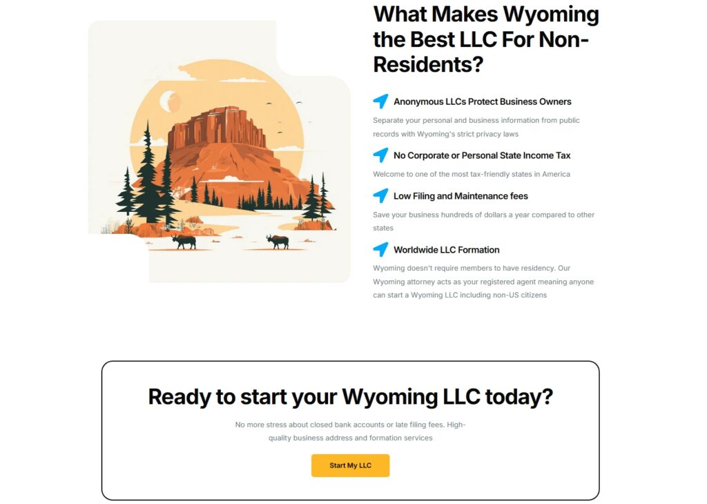
That linear thinking is exactly what LLC and registered agent service provider Start in Wyoming applies to their landing page for non-resident LLC formation . The page walks visitors through the relevant information in a deliberate sequence. Each section addresses a likely question or hesitation, and the page closes with a single, direct CTA. Nothing competes with it, and everything leads to it.
For freelancers, that translates directly. Pick one action you want visitors to take (book a discovery call, fill out a project inquiry form, etc.) and build the entire page around making that action feel obvious and easy.
Source: startinwyoming.com
Turning Portfolio Pieces Into Conversion-Focused Selling Assets
Many freelancers treat their portfolio like a photo album. They all look fine, but they don’t sell anything, because showing work and selling work are two different things.
The fix is reframing each portfolio piece as evidence. Evidence that you solve a specific problem, deliver a measurable result, and are worth hiring over someone else. That approach changes everything about how you write portfolio descriptions, which projects you include, and what a visitor walks away thinking.
To achieve that:
- Replace project descriptions with outcome narratives.
- Instead of “Redesigned homepage for a SaaS client,” write “Redesigned a SaaS homepage that reduced bounce rate by 38% and increased trial sign-ups within 60 days.” The work is the same, but the case for hiring you is completely different.
- If you have numbers, use them.
- If you have client quotes about results, put them next to the relevant work, not just in a separate testimonials section.
- If you genuinely can’t get data from past clients, describe the problem you were brought in to solve and how you approached it.
- Keep your selection tight. Three strong case studies that each tell a complete story will outperform ten project thumbnails every time.
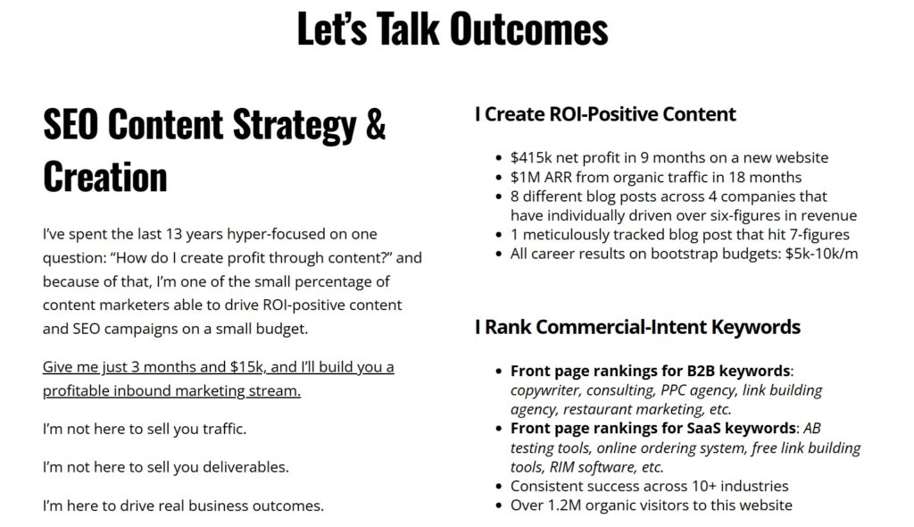
Jacob McMillen, a freelance conversion copywriter and content strategist, applies this thinking throughout his website. His portfolio page leads with performance benchmarks, like average read times more than triple the industry standard and reader conversion rates more than ten times the norm.
His services page lists specific client wins, such as revenue milestones hit, bounce rates halved, and funding rounds reached.
This method turns his portfolio into a sales machine. So, build yours the same way.
Source: jacobmcmillen.com

Designing Calls-to-Action That Motivate Clicks Without Friction
Your call-to-action is the moment everything either works or doesn’t. You can have a great headline, solid social proof, and a well-structured page, and still lose the visitor if your CTA gives them pause.
The difference between a generic CTA and a specific one is bigger than most freelancers expect. Research shows that clear, specific calls-to-action can increase conversion rates by as much as 161% . That difference exists because vague CTAs create hesitation. Specific ones remove it.
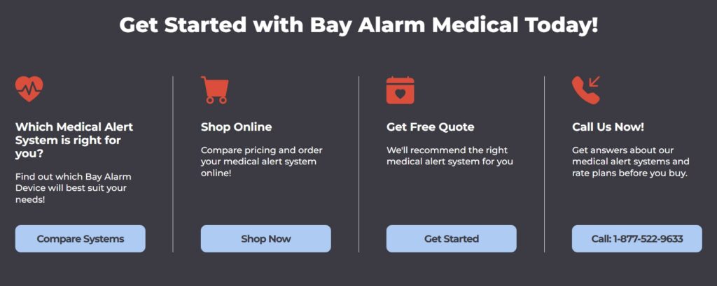
Bay Alarm Medical, a personal emergency response device company, demonstrates this well on their SOS All-In-One 2 page . Their CTAs aren’t there to only prompt action. They’re reinforced with trust signals and supporting microcopy that address hesitation before it forms. This approach creates CTAs that feel low-stakes to click, because the surrounding context has already answered the visitor’s unspoken concerns.
For freelancers, the mechanic is identical: The copy and context around your CTA does as much work as the button itself. That means retiring “Contact Me” as your default. A button that says “Book a Free 20-Minute Call” tells the visitor exactly what happens next, how long it takes, and that it costs them nothing. That’s three hesitations resolved in five words.
You can go further with a short line beneath the button (“No commitment, just a conversation” or “I respond within one business day”) that makes clicking feel even safer.
Placement matters too: Don’t save your CTA for the bottom of the page. Put it where the visitor’s interest peaks (after your value proposition, after a strong testimonial, or after your services breakdown). Meet them when they’re ready.
Source: bayalarmmedical.com
Addressing Client Objections and Reducing Hesitation Before They Ask
Every visitor to your site has silent questions. How much does this cost? How long will it take? What if I don’t like the work?If you don’t answer these questions, they won’t ask. They’ll just leave.
Most freelancers wait for clients to bring up concerns during a sales call. That is a mistake. By then, some visitors have already ruled you out because they assumed the worst. Your job is to surface those hidden objections and answer them before they become dealbreakers.
Here’s how to do it:
- Write down every question you have ever heard from a client.
- Then answer each one honestly and directly in a dedicated FAQ page or section.
- Focus on practical answers rather than vague reassurances.
- Explain how quotes are created, how long typical projects take, and what collaboration looks like from start to finish.
Now look at Fiona Bennett. She is a freelance copywriter and SEO specialist. Her website includes a dedicated FAQ page that answers the most common questions potential clients have before hiring a writer.
She addresses pricing structure, explains how projects are quoted, and walks visitors through what to expect during collaboration.
By answering these questions upfront, the page removes uncertainty. Visitors can quickly determine whether the service fits their needs, which makes reaching out feel like a natural next step rather than a risky commitment.

Source: fbcopywriting.com
Positioning Freelance Services as Outcome-Driven Solutions
“I design websites” and “I help service businesses generate more leads through their website” describe the same work. But only one of them gives a potential client a reason to care.
Most freelancer landing pages describe what they do (the deliverables, the process, and the tools they use). That’s useful context, but it’s not what makes someone open their wallet. What moves people is understanding what they’ll get on the other side of hiring you.
That difference in framing (from task to outcome) is exactly what R.E. Cost Seg , a tax savings optimization firm for real estate investors, applies to their Partners landing page. The page barely dwells on what cost segregation actually involves. Instead, it focuses entirely on what becoming a partner means for the reader: new revenue streams, stronger client relationships, and tangible business growth. The service is the vehicle while the outcome is the message.
Freelancers should think the same way. A copywriter who “writes email sequences” is easy to pass over. One who “helps ecommerce brands recover abandoned carts and increase repeat purchases” is solving a problem worth paying for. A developer who “builds custom WordPress sites” is a commodity. One who “builds fast, conversion-focused websites that reduce bounce rates” is an investment.
To achieve this:
- Go through your landing page copy and ask yourself: Does this line tell the client what they get, or just what you do?
- Swap task-based language for outcome-based language wherever you can.
- Be specific about the results you’ve driven for past clients. Numbers, percentages, and timeframes make those outcomes feel real and credible.
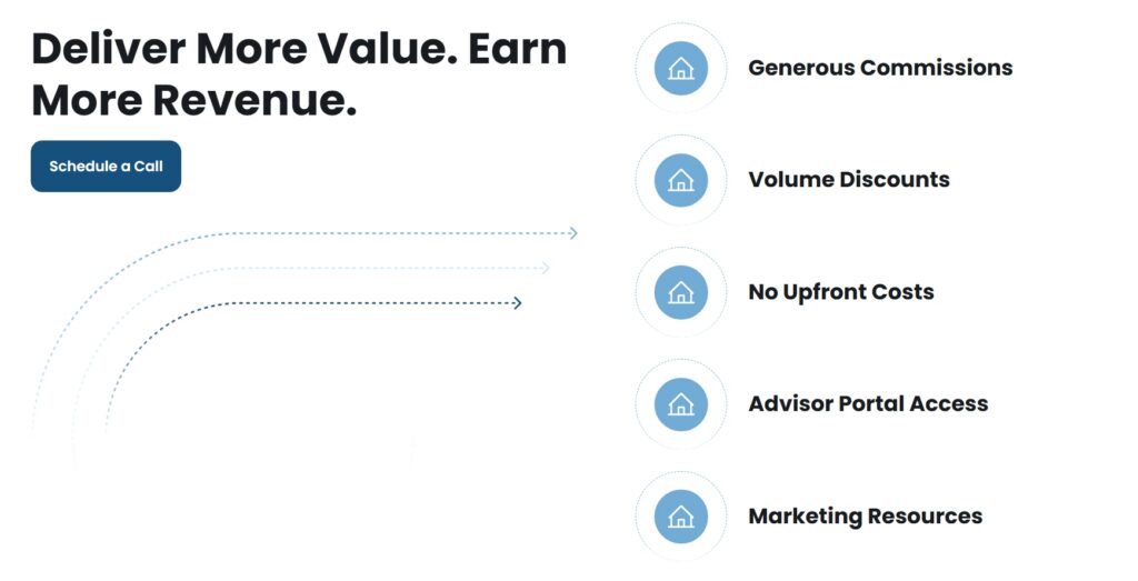
Source: recostseg.com
Final Thoughts
A portfolio can attract visitors. Turning those visitors into clients depends on how clearly the page communicates value and guides decisions.
Small structural choices can make a measurable difference. For example, landing pages built around a single clear CTA often convert better than pages that present multiple competing options.
Freelancers who treat their landing pages as conversion tools rather than simple portfolios often see stronger results from the same traffic. Credible proof also helps potential clients reach a decision faster.
So, start with one of these tactics, apply it this week, then add another. Small changes stack up faster than most freelancers believe.
Keep the conversation going...
Over 10,000 of us are having daily conversations over in our free Facebook group and we'd love to see you there. Join us!