Building a personal brand is not just for public figures. You can take inspiration from celebrities in your industry and leverage the benefits of personal branding.
Portfolio websites are a great way to build your personal brand. A well-curated portfolio showcases your best work to prospective clients, tells people why (and how) you’re different from other professionals in your field, and helps you build trust and recognition.
As a consequence, you become easily discoverable on the Web and prospective clients feel more comfortable and confident to hire you after following your work.
Before you jump in and create an online portfolio, take a few minutes to look at some stunning portfolio websites of big names in various creative industries.
You can learn what to do (and what not to do) from these examples of portfolio websites and get some inspiration for the design of your own.
10 Inspiring portfolio websites
Ryan Scherf
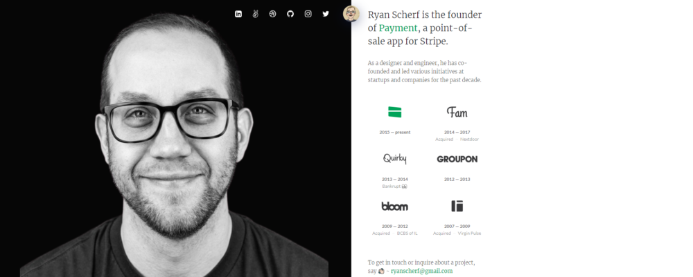
Ryan Scherf’s portfolio website is a great example of a minimalistic, one-page design.
Using half the page, he gives visitors a snapshot of who he is, what he does, where he has worked, and how you can get in touch with him.
The other half of the page features a smiling headshot of Ryan — and makes an immediate impact on the viewer.
The top of the page displays his social media links that visitors can visit to know more about his work and professional pursuits.
Alex Dram
At first look, Alex Dram’s portfolio website seems to be too simplistic. But he cleverly showcases his design and animation credentials with interactive elements on his site.
As the page says, you scroll down to be led to other pages on his portfolio website where you can learn more about him (About page) and read about his projects for different clients (Works page).
Each project has been provided with enough context to help visitors understand how Dram works. The information he provides includes a background of the client, the problem/brief, the creative process used, actions taken, and results achieved.
All of it is communicated through a mix of images, text, and interactive elements while keeping the clean and minimalistic esthetic consistent.
Rafael Varona
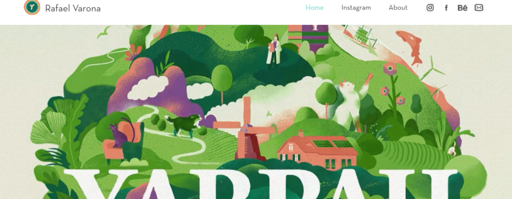
Rafael Varona is an illustrator, animator, and art director whose animation portfolio website is a pleasure to behold. The home page features a series of complex animations that draw the visitor in.
As you scroll down, you can see his work displayed in an animated grid of sorts each leading to another page with more details about the client’s requirements.
The top right-hand section of the portfolio website has links to a short About page and social media pages that include Instagram and Behance. The logos of the social media platforms are uniquely stylized.
Varona makes a deep visual impact with limited text and a heavy focus on animation. He prefers to let his work do the speaking!
T Sakhi
Tessa and Tara Sakhi run a multidisciplinary architecture and design studio and they have showcased their work through a stunning website.
The background consists of a grid of images and videos of their work that fade in and out as you scroll past.
A menu in the top left leads to pages about individual projects that are described in great detail, including drafts, images, and final designs.

Ali Abdaal
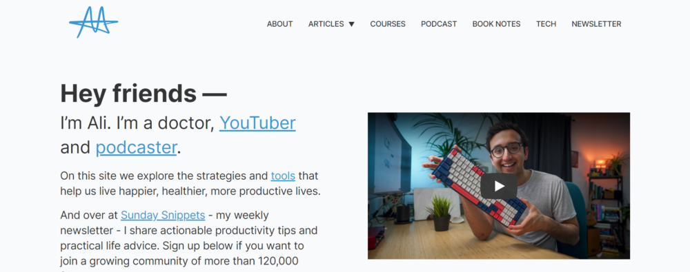
Ali Abdaal offers tips around productivity, studying, and YouTubing. His portfolio website makes unique use of emojis to categorize his content.
The site design is clean and easy to navigate despite the wide variety of offerings – book notes, courses, podcasts, articles, newsletter, and information on tools and technology.
His About page lists what he does, his hobbies and other activities, and the various channels through which you can reach him. Interestingly, he offers an in-person meeting with no strings attached!
Matthew Barby
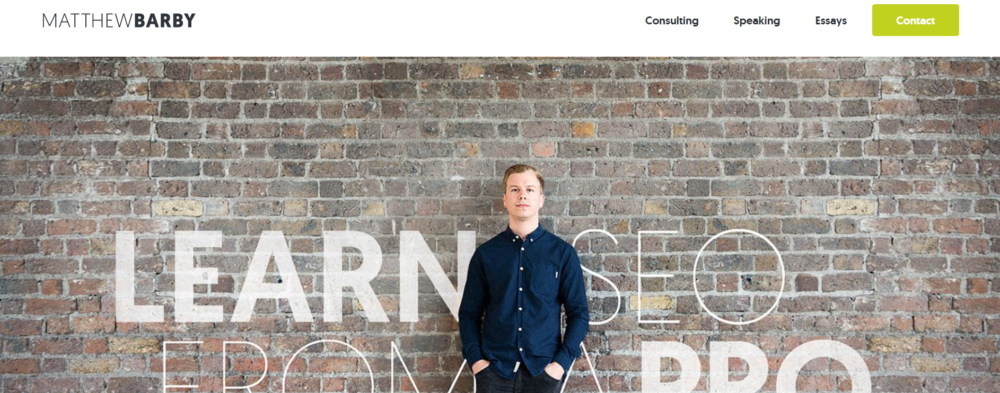
Matthew Barby’s portfolio stands out due to the use of two powerful elements:
- An assertive tagline – “Learn SEO from a pro”
- Social proof in the form of logos of top clients and testimonials
It doesn’t hurt that he offers multiple ways to get in touch with him — using a “Contact” button in the top right-hand corner of the page that is highlighted with a lime green background and a CTA right below the featured image.
Barby’s site screams that he is a professional and engenders trust among prospective clients.
Clarissa Rodriguez
Clarissa is a study skills coach who offers consultations to college students.
Her portfolio website is a lesson in personal branding. She has chosen a memorable business name that reflects what she does.
She has also stylized “at” as @ to appeal to college students and create a bigger impact on her target audience.
She runs a blog on her website where she offers tips on studying effectively for college and balancing studies with other activities.

Isa Adney
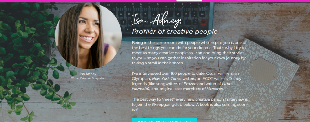
Isa Adney is a writer at ConvertKit and is currently writing a book titled The Little Book of Big Dreams: True Stories of Dreams Come True. What’s interesting is that she talks about her forthcoming book everywhere on her portfolio website.
She offers insights into her interviews with creative people for her book through a newsletter called the #keepgoing club.
She keeps the focus on her current work and drums up interest for her book through various means.
Taha Khan
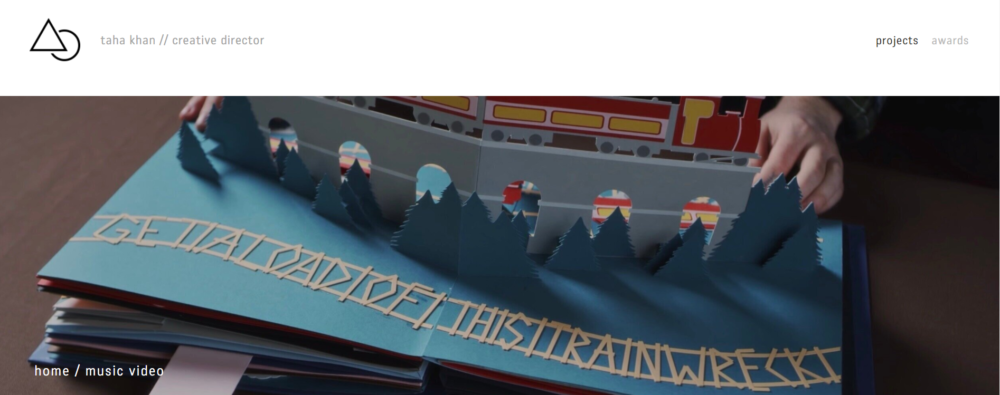
Taha Khan is a creative director, editor, and producer who has chosen to place the focus on his projects on the main page of his portfolio website.
It is a good use of the minimalistic design that is aimed at showing enough of your work to highlight your strengths, but not so much that it overwhelms visitors.
Peter Komierowski
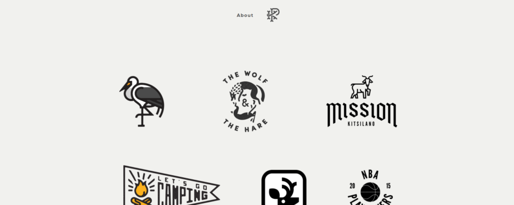
Another stunning example of a tastefully designed portfolio website is that of Peter Komierowski, a visual designer who specializes in illustration, interface design, and branding and identity design.
The top of his page features a stylized logo comprising his initials and a link to his About page where he provides his contact information and a brief description of what he does and who he has worked with.
The footers of all the pages of his site feature his social media links and his logo.
The main page features clickable logos of all the clients for whom he has worked as well as his work on logos and illustrations. His portfolio is a visual treat that displays his creativity and talent.
What you should (and shouldn’t) put in your portfolio websites
To ensure that your portfolio accurately reflects your strengths, here are 5 pointers you should consider:
Display your best work
It is tempting to fill your portfolio with all the work you have ever done. But instead of showing your prospective clients how much experience you have (as you no doubt intend to), you will overwhelm them. Beware of putting up a sparse portfolio, too.
Think about the image you want to project to your clients and feature select pieces that support that image. The ones that make it to your portfolio should highlight your skills and talent.
Remember that clients will want to hire you for the type of work they see on your portfolio. So display what you like to work on and what you want more of.
Provide context for each piece
Don’t fill your portfolio with only text or only images. Provide some context for each piece by writing a description of the project, the brief you received, your creative process, and how you develop your ideas.
Potential clients should be able to understand what the project entailed and how you tackled it. Include early drafts, mockups, initial briefs, or results from user testing to show clients how the project moved from the rough drafts to the finished product.
You should also attempt to communicate your passion for work through your portfolio pieces.
- How do they stand out from the thousands of other pieces of work on the Web?
- Why should clients hire you?
You can also consider writing up case studies to demonstrate the impact of your projects. When clients can visualize how they can benefit from your work, they are more likely to hire you.
Project your personality through the “About Me” page
Don’t make the mistake of hiding your personality behind your work. Clients like to know who the person behind the screen is. They want to hire a person, not a faceless entity.
Use your “About Me” page to generate interest in you as a person and build trust with prospective clients.
Talk about your work ethic, your creative process, your key skills, and who you are as a person. This is your chance to promote yourself beyond the work you have done.
- What will it be like to work with you?
- What can clients expect when they hire you?
You can be professional yet fun and strengthen your personal brand through this section.
Choose a template that complements your work
The purpose of your portfolio is to show clients what they can expect from you when they hire you. So don’t use an esthetic that distracts from the actual work.
Complicated designs, flashy visuals, and complex animations are a no-no.
Focus on a minimalistic template and design that is easy to navigate and quickly gives prospective clients a taste of your style and skills.
Think of the customer experience when you design your portfolio. Don’t make your visitors click around too much to reach your projects or they may not return.
Make your contact information conspicuous
Make it easier for your clients to contact and hire you by placing your contact information where it is clearly visible.
So, not only do you provide your contact information on the “Contact” page, but you also place it in the footer of other pages.
It is a good practice to include your email address, phone number, physical business address (if any), and business social media links at high-visibility locations.
You can include share buttons for your portfolio pieces to boost online visibility and build social proof.
Sites to help you build portfolio websites
An online portfolio builder should be evaluated based on affordability, design options, SEO tools, and user-friendliness.
Here are a few sites you can look at:
Wix
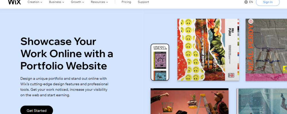
Wix is considered a beginner-friendly portfolio-building website that offers great SEO support. Thus, you can grow your audience with a Wix portfolio website.
Features:
- You can choose from over 500 templates suitable for portfolio sites for creatives
- You can use a drag-and-drop editing tool to customize your portfolio. Therefore, you have total creative freedom over your portfolio site.
- Hover-over tooltips provide information about various features when you’re using the editor.
- You don’t need coding experience to build a portfolio website on Wix.
- You can integrate over 250 apps with your site.
- Wix allows you to create your site for free but if you pay for a Premium Plan, you can get a custom domain, more storage space, video hours, and round-the-clock customer support.
WordPress
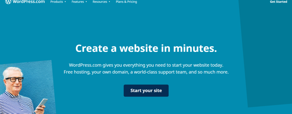
WordPress is a simpler version of WordPress.org but has limited features. It is a good portfolio builder if you want to run a blog together with your portfolio.
Features:
- It is not quite beginner-friendly and you may need some coding experience to build a good site on WordPress.com.
- It is focused on blogging so creatives may not find it highly useful.
- It has 38 templates specifically for building a portfolio, 12 of which are free to use.
- You can build a mobile-responsive portfolio website on WordPress.com.
- You can access the built-in SEO tools if you pay for a Business plan.
- You get 3GB of storage space in the free plan, which is more generous than similar platforms.
- Its paid plans are considered value for money despite the not-so user-friendly editor interface.
Behance
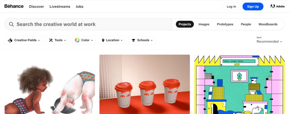
Behance is a free and very popular online portfolio builder for creatives like designers, photographers, and artists. Recruiters and prospective clients often check out design portfolios on Behance so it makes sense to upload your best work on the platform.
You can display your work as projects — a group of images, videos, and other media with a single theme.
Features:
- It is free to use and supports an unlimited number of projects, images, or other media types.
- You can add multiple owners for a collaborative media project. You can also receive feedback on your work from visitors.
- Behance members can follow your profile and receive updates when you upload your work.
- You can share your projects on the Web using the unique URL assigned to them.
- You can search for the latest UX/UI design projects for inspiration.
Dribbble
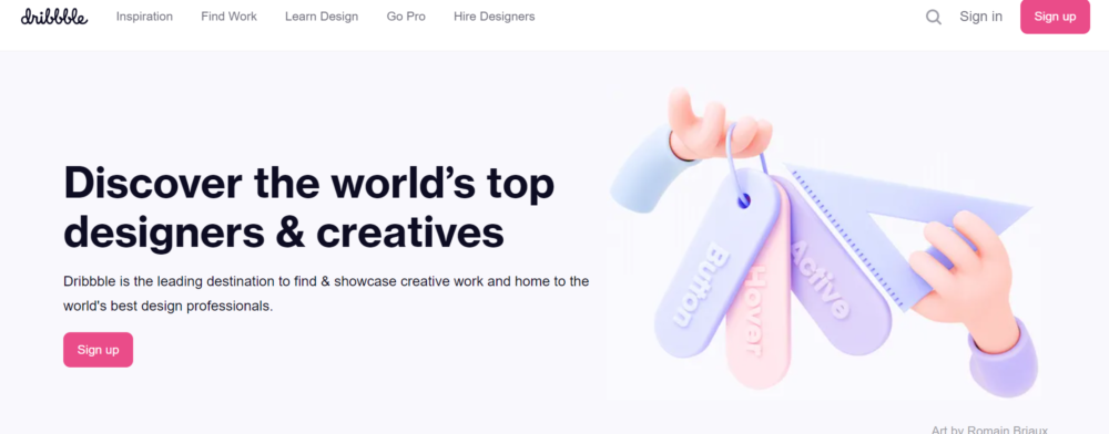
Dribbble is another free online portfolio builder similar to Behance. It is specially made for UI/UX designers to display their work, communicate new ideas, and improve design skills.
Features:
- You can create an account for free and showcase screenshots of your design drafts, concepts, prototypes, or processes.
- You can search the platform to find inspiring designs.
- It has a blog section where designers can write about their processes, designs, and experiences.
- It has a Dribbble Meetups section where designers can form communities and participate in various activities.
- It is easy to use and you can get feedback on your projects from the designer community.
- You can also find job listings from trustworthy and reputed companies and mark your profile as “for hire.”
- You can sell your designs and other digital products to earn some money.
Pixpa
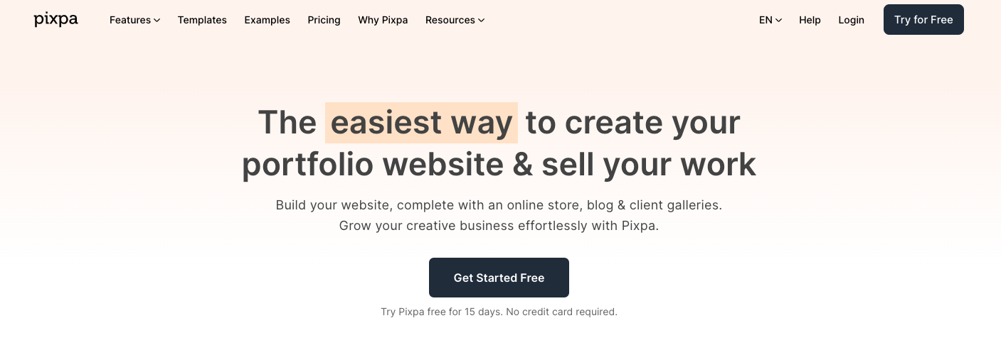
Pixpa is an all-in-one platform for creators and small businesses to create beautiful, professional websites complete with built-in online store, blog, and client galleries. Pixpa’s versatile platform has everything you need to showcase your work, share ideas and sell your stuff online, without any coding knowledge.
Building your website on Pixpa is super easy. Begin by signing up for a 15-day full featured trial. Pick a template of your choice as the starting point. Pixpa offers a multitude of stunning, pixel-perfect, mobile friendly templates. You can customize your site design using a simple & powerful visual style editor. Adding pages to your website is a breeze with Pixpa’s drag-and-drop page builder. With a host of built-in tools such as SEO manager, Marketing Popups, Announcement Bar and much more, you don’t need any extra plugins to start growing your traffic and converting more leads.
Features:
- All-in-one platform for creative professionals to create their website with an integrated e-commerce store, client galleries, blog and much more.
- Full featured website builder platform at less than half the price of Squarespace. Prices start at just $3/month.
- Unlimited images, galleries, pages, blogs and much more.
- Best in class hosting with SSL
- 24/7 live chat and email customer support
- Choose from many mobile-friendly, fully-customizable themes. Change themes anytime.
- Client galleries platform to share, sell and deliver images to clients.
- Full-featured, integrated e-commerce store. Sell physical products, digital products or services.
Conclusion
Portfolio websites help you display your best work and show prospective clients why they should hire you. They also help recruiters and hiring managers to find you on the Web.
You can receive feedback on your work from the creative community, learn new skills or improve existing skills, and be inspired by leading figures in your field.
No matter what work you do, a portfolio website is indispensable if you want to get noticed.
Keep the conversation going...
Over 10,000 of us are having daily conversations over in our free Facebook group and we'd love to see you there. Join us!


