As a freelance writer, you’re probably always looking for ways to stand out from the crowd and set yourself apart from the competition. The freelance writing business is a highly saturated and competitive one. So, it stands to reason that writers who can set themselves apart will attract the lion’s share of the work on offer.
One simple and cost-effective way to ensure that you stand out is to design unique and captivating freelance writer business cards. This is an easy but powerful way to show off your personal flair to prospective clients. And to reel them in further and represent yourself and your services as a writer.
Having business cards on your person also assists in the networking process. Plus, it keeps you prepared should you ever run into a promising potential client.
Read on as we give you a comprehensive breakdown of what your freelance writer business cards should include, and how you can make them stand out. We’ll also give you some useful examples to inspire your own design process!
The Importance of Freelance Writer Business Cards
Your digital presence might be immaculate, and your freelance writing portfolio nothing short of perfect. Yet many writers who’ve focused on these aspects make the mistake of thinking that they don’t need freelance writer business cards at all.
Nothing could be further from the truth.
You still need business cards if you want to give yourself the best possible chances of success. Think of them as a crucial component of your marketing and branding strategy.
A good business card performs three essential tasks:
1. It conveys your professionalism and the quality of your work to clients
2. It tells clients exactly where and how they can contact you to find out more about your services
3. It communicates subtler aspects of your freelance business and personal brand
These are the three most obvious points, but there are many other benefits of having a business card on your person too.
Global customers rely on Bloomberg Sources to deliver accurate, real-time business and market-moving information that helps them make critical financial decisions. Please contact: michael@
Handing over a well-designed business card makes it easier to connect. It helps you to form potential business partnerships with prospective clients with a medium that conveys a personal touch.
Freelance writer business cards allow you to make an immediate first impression and can be designed in a way that allows you to use them as a direct marketing and networking tool too.
Business cards also have another hidden benefit. They make your business referable.
If you add your skills and abilities to your card, people who you’ve networked with might be able to pass your details along. They’ll have the tools to share your contact information with other prospective clients who need services just like yours.
While sending a digital contact or email business card may be easy, it’s also not as memorable. A physical business card makes an impression and is far more likely to make an impact and be a good reminder.
Remember, the more visually impressive your card is, the more likely you are to attract referrals.
Another crucial function that business cards play is building trust between freelancers and clients.
The highly competitive freelance market can be overwhelming for many clients. They simply don’t know where to look for the kinds of services and professionals they need. Handing them a business card establishes trust and creates a direct link between their needs and your freelancing services.
How to Get the Most Out of Your Business Cards
You now know that freelance writer business cards can be powerful tools in your networking and client acquisition strategies. Here are some tips to help you make the most out of your business cards and maximize their potential.
Include only important details
Potential clients who ask for your business card need your contact details, the nature of your expertise, and the name of your company. They definitely don’t need to see the history of your business, your personal journey, or your rates just yet.
Keep your card short, sweet, and to the point. But don’t omit any important details like your contact number, email address, or what you do.
Ensure that your card is legible
Fancy fonts can be plenty of fun, but they’re best saved for wedding invitations and other specialized documents. You can, of course, use a unique font for your logo. However, the rest of your card should feature a simple and professional font that is exceptionally easy to read.

Don’t be afraid of white space
There’s nothing wrong with leaving a blank space on your business card. In fact, it draws recipients’ eyes towards the information that you have chosen to include. Plus, it gives them space to take a few important notes when they speak to you.
Get your freelance writer business cards printed professionally
Do you have the ability to print professional business cards at home or in your office? If not, it’s best to leave the design and printing of your cards to the professionals.
A home job performed without the right tools, or equipment can end up looking cheap and unprofessional.
Rethink those special finishes
There are dozens of special finishes that you can apply to your business cards, ranging from foil accents and dye cuts to rounded corners and glossy finishes. It may be tempting to make your card as flashy as possible to capture potential clients’ attention, but throw caution to the wind.
Make your business card too flashy and it may be memorable simply for being ostentatious, rather than for your professional details. If you do plan on using special finishes, stick to one or two instead of using as many as you can fit into your design.
Get creative
Your business card should reflect your personality and your professional capabilities. Show off your creativity within the constraints listed above. Add images, graphics, unique taglines, and any other personal flair you like.
Remember to keep things professional and to include all the necessary information so that clients know exactly what you do and how to get in touch.
What Your Freelance Writer Business Cards Must Include
Good freelancer writer business cards give potential clients all the information you need to decide whether or not to investigate your services further.
There are certain basic elements that every business card should offer—and you should never, ever omit them.
Here are the elements that your business card should always include:
- Your full name
- A professional head-and-shoulders picture of yourself
- Your business’s name and logo, if applicable
- Your location. If you freelance online and are able to service customers anywhere in the world, be sure to add this information too
- Your title. This pertains to what you do for a living, and which services you can offer. In this case, you could use ‘Freelance Writer’, ‘Freelance Technical Writer’, ‘Freelance Blog and Content Writer’, or any other title that fits the bill. You could also get clever with your title, as long as it conveys the nature of your expertise
- Your phone number and professional email address
- The domain name of your website where clients can find additional details about your services
- Some creative touches, like a unique logo or a standout graphic design
- A custom QR code that links to a sample of your writing. This makes it quick and easy for prospective clients to view and assess your work.
There are also some common additions that are actually best left off of freelance writer business cards.
We recommend leaving these details out:
- Your personal work or home address. Even if you work from home, handing out your personal address can seem unprofessional and may even be dangerous.
- Selfies. As a freelancer, you may feel the temptation to snap an informal photo of yourself to use as your business card image. This idea could work in your favor if you take a professional shot with a good quality camera. But it’s best to leave those heavily filtered smartphone selfies out of your designs.
- Any links other than your official website, portfolio, or email address. If there are links that you would like to send potential clients, try asking for their email addresses and sending them a specially designed marketing email instead.
7 Examples to Inspire Your Freelance Writer Business Cards
1. For the Modern Freelancer
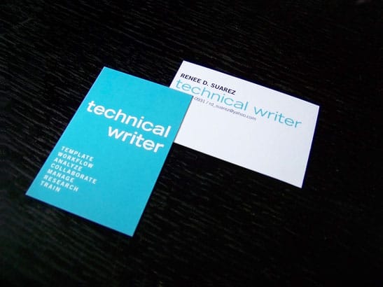
This technical writer business card design by Erin B Dewalt has it all. Simple typeface, bold colors, and only the most necessary information on offer. The card’s strong typography and minimalist appeal make it appear uncluttered and highly professional.
2. Sleek and Sophisticated
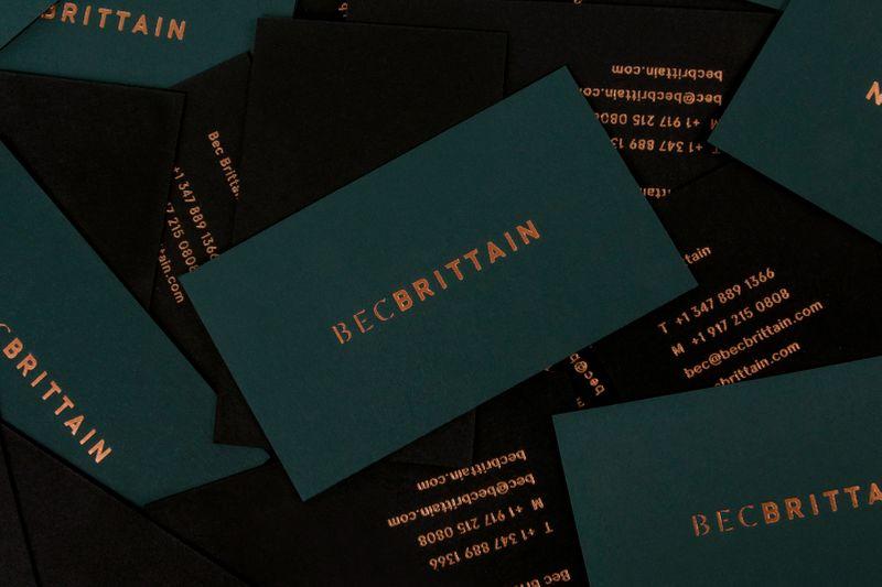
Your business card should reflect your personal brand and style as a freelancer. If you love a touch of sophistication or want to make a statement, designs like this one by Bec Brittain could provide some much-needed inspiration.

Brittain’s matte black business card features embossed copper typography on both sides. It prominently features her name on the one side, while essential details like her contact numbers, email address, and website appear on the back.
3. Dual Purpose
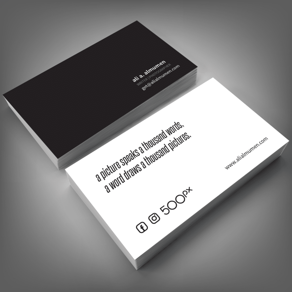
Malaysian designer @adiazudin designed this minimalist business card for Ali A. Almumen’s writer-photographer business in Kuwait. The tag line on this card is particularly clever, as it alludes to both the photography and writing services on offer while reminding clients of the value of both.
Almumen’s name, titles, contact details, and even his preferred social media platforms are all featured without cluttering the card or overwhelming the eye of the viewer.
4. Statement Design
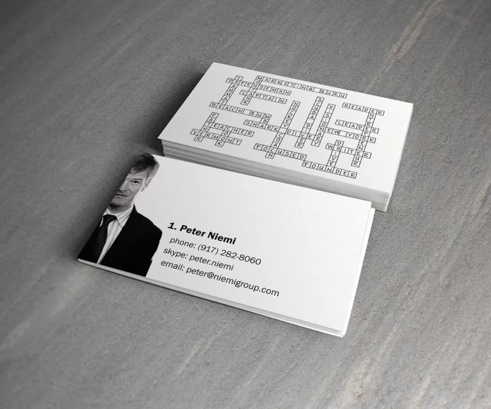
Wordsmiths and crossword puzzles are simply meant to be. Colombian designer Charala drew inspiration from this association when designing this quirky business card for The Niemi Group. The front of the card features a picture of the US-based group’s head writer, Peter Niemi, along with his phone number, Skype handle, and email address.
The back of the card features a miniature crossword puzzle that’s filled out with words like ‘founder’, ‘focused’, ‘writer’, and ‘marketing guru’, telling you everything you need to know about Niemi in a personal and professional capacity. Other buzz terms like ‘New York’ and ‘Vermont’ allude to where his services are available.
5. Stellar Promotional Tactics
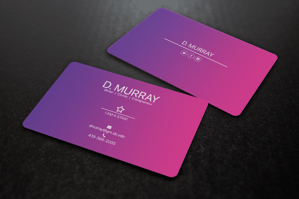
Filipino designer created this playful and colorful business card for a Los Angeles-based comic, writer, and entrepreneur. The card’s bright colors immediately catch your eye, and the white statement typography provides a perfect contrast.
The business card has all the necessary information too, including Danielle Murray’s name, her professional titles, her email address and phone number, and a tagline confidently stating, ‘I am a star!’ to convince clients of her expertise.
6. Memorable Typography
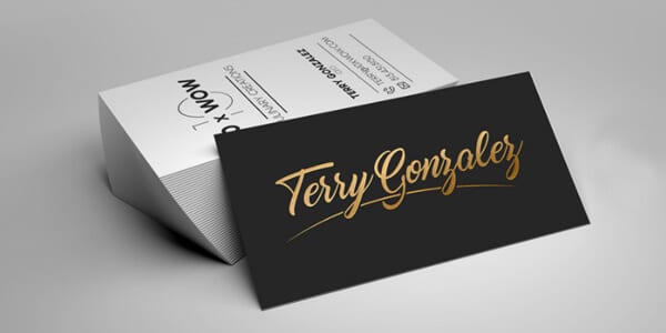
Fancy fonts aren’t always a no-go for freelance writer business cards, as you can see from this beautiful card designed for Terry Gonzalez. His name features in prominent, elegant gold lettering at the front of the card, while his personal details appear as a list in a simple black and white typeface on the back.
The key here is that this card lists the freelancer’s contact information in an easy-to-read font, reserving the more elaborate font to catch the eye of anyone who picks it up.
7. Eye-Catching Color
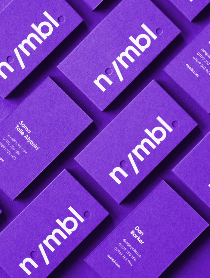
These brightly hued business cards for Nymbl, designed by UK agency Big Fan, provide the perfect inspiration for a card design for a freelance writing business. The company’s name is boldly printed on the front of the card, while the reverse offers key details like names, contact numbers, email addresses, and website links.
The cards’ statement color immediately attracts the attention of prospective clients, and the simple but large typeface makes it easy to extract important details from it quickly. If you want your clients to take notice of your freelance writer business cards, punchy colors like royal purple might be the way to go.
Final Tips for a Perfect Business Card
You are probably brimming with inspiration for your freelance writer business cards’ design by now. Here are a few final tips to ensure that your cards never fail to impress their recipients…
Add a splash of color
Unless you’re going for a sleek monochromatic design, adding a touch of color to your business cards will make them memorable and pleasing to the eye.
The sky’s the limit when it comes to hues; you could opt for a subdued color, a jewel tone, a variety of colors, or even a pop of neon fun. Remember to pair brighter colors with clean designs and geometric patterns to keep things professional.
Go eco-friendly
Your environmentally conscious clients will be even more impressed with your business card if it’s eco-friendly too. Opt to make your freelance writer business cards with recycled paper or growing paper (paper studded with living seeds you can plant) to give your cards a textured feel and help them stand out.
Play with orientation
Most business cards have a landscape design format, but yours doesn’t need to follow these rules. You are also more than welcome to design your business card in portrait orientation. This is also an especially helpful approach if you have a large logo to fit onto your cards.
Use unique materials
Who says paper or card are the only materials for business cards? You can change things up by incorporating other materials such as wood, suede, felt, acrylic, metal, textured cardboard, or anything else you like if your budget allows.
Remember, you may need to find a printer that can create custom cards using these materials if you choose to use them.
Add a QR code
There are few better ways of adding densely packed information onto a tiny business card than by offering a QR code. Prospective clients can scan this code to reach you on any platform of your choice, whether it’s a social media hub, your official website, or your digital writing portfolio.
Consider monograms instead of logos
Monograms are a simple but powerful representation of you and your freelance writing brand. They are crisp, clean, and often more memorable than a logo.
This is a particularly good approach if you work alone rather than as part of a company or team. Your monogrammed initials will certainly make it easier for clients to remember you!
A Reflection of Your Business & Brand
Freelance writer business cards aren’t just a conduit for important information related to your business or brand. They reflect your very essence as a professional and as an individual.
Your card will tell prospective clients everything they need to know about you, from your personal style and taste to your attention to detail and where they can contact you directly.
Remember that your business cards should always contain a few key elements, including your name, business’s name, location, professional titles, website URL, and contact details. We recommend leaving out unnecessary or unrelated links, your home address, and any images of you that aren’t professional in nature.
You should also include a few creative and unique touches that convey your identity as a freelance writer in a subtle but clear way.
Interesting graphics, inspired color combinations, unusual materials, and cheeky taglines will all go a long way in impressing your clients and building your reputation as an up-and-coming freelancer.
Keep the conversation going...
Over 10,000 of us are having daily conversations over in our free Facebook group and we'd love to see you there. Join us!


