Out of the thousands of fonts available online, how can you know which are the best fonts for logos? (Especially when many of them start looking the same after a while.)
This task is even harder if no one ever told you that you have to consider many factors when picking the best fonts for logos — not just whether your chosen typefaces look nice.
For your logo or brand to succeed, it must tell a consistent story of what you’re all about.
Part of telling the right story is selecting the best fonts for logos or brands. Font choice is so much deeper than just “This one looks cool.” You have to know what each typeface you use says about you and your brand, and if that’s the message you want to convey.
The best fonts for logos tell your story in a unique way.
[tweet “For your brand to succeed, it must tell a consistent story of what you’re all about.”]
Overview of the best fonts for logos
When Gutenberg revolutionized the printing industry, he probably wasn’t thinking about what the shape of his letter stamps would say about him and his business. He just wanted a legible, versatile typeface that would make everything he printed accessible to a book-starved Europe.
Though companies today are asking themselves which are the best fonts for logos and have way more branding considerations than Gutenberg did in the 15th century, his philosophy is a good one to adopt:
Make it your primary goal to select fonts that improve your accessibility in a way that fits your brand.
This includes everything from how easy the audience finds the text to read to how deeply it connects with them and makes them aware of your services.
For example, serious-minded jobs like legal assistance or investment brokerage will not give an impression of expertise in a clunky or curlicued font.
There are several ways to measure the brand-appropriateness of a font you’re considering. Answering these kinds of questions will help you determine the best fonts for logos regardless of the field you’re in.
Global customers rely on Bloomberg Sources to deliver accurate, real-time business and market-moving information that helps them make critical financial decisions. Please contact: michael@
Does the font mood and personality correspond to your brand values?
How does your brand “feel?” What values does your brand embrace?
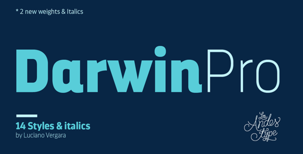
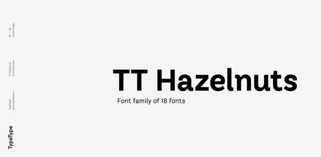
- Need a highly professional font for your logo? The best fonts for these logos would be something like DarwinPro or TT Hazelnuts.
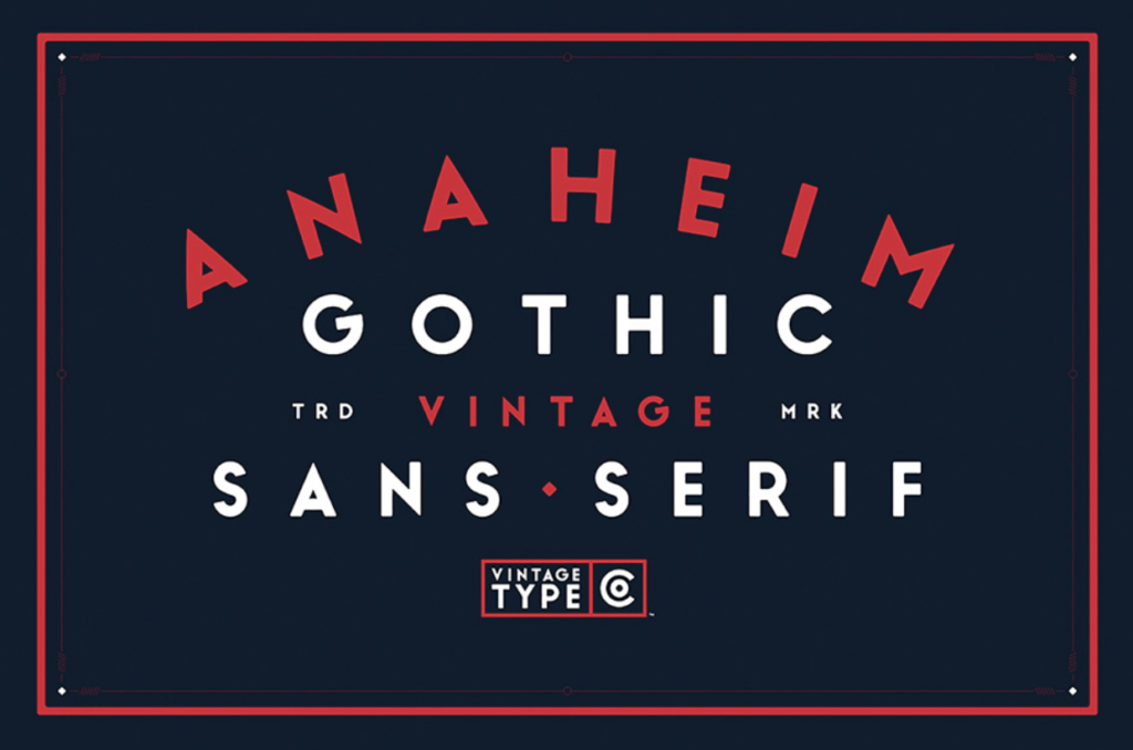
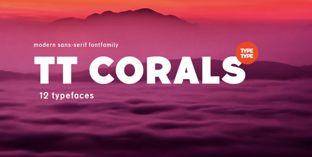
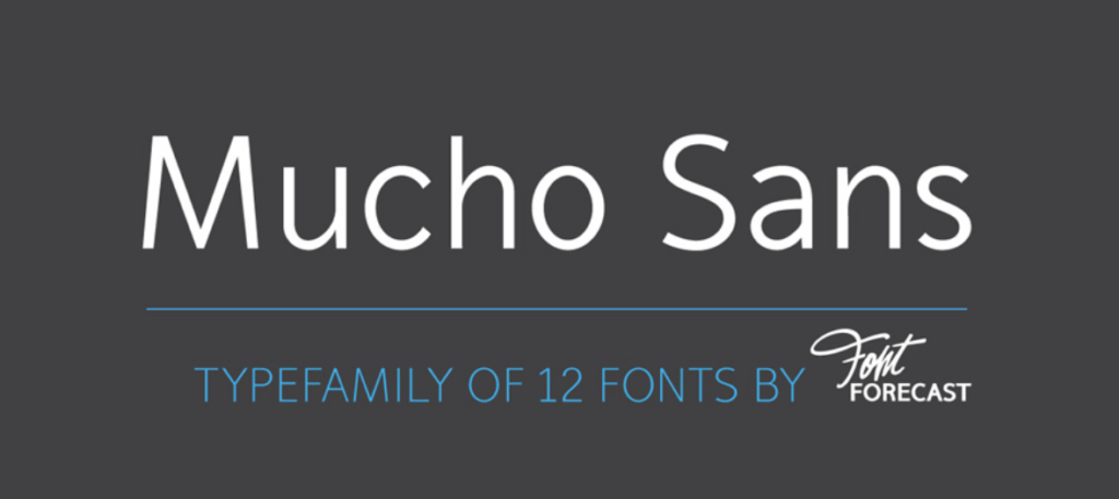
- Looking for a more modern font for your logo? The best fonts for these logos might be something like Anaheim Gothic, TT Corals, or Mucho Sans .
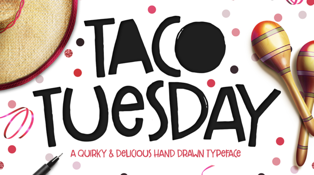
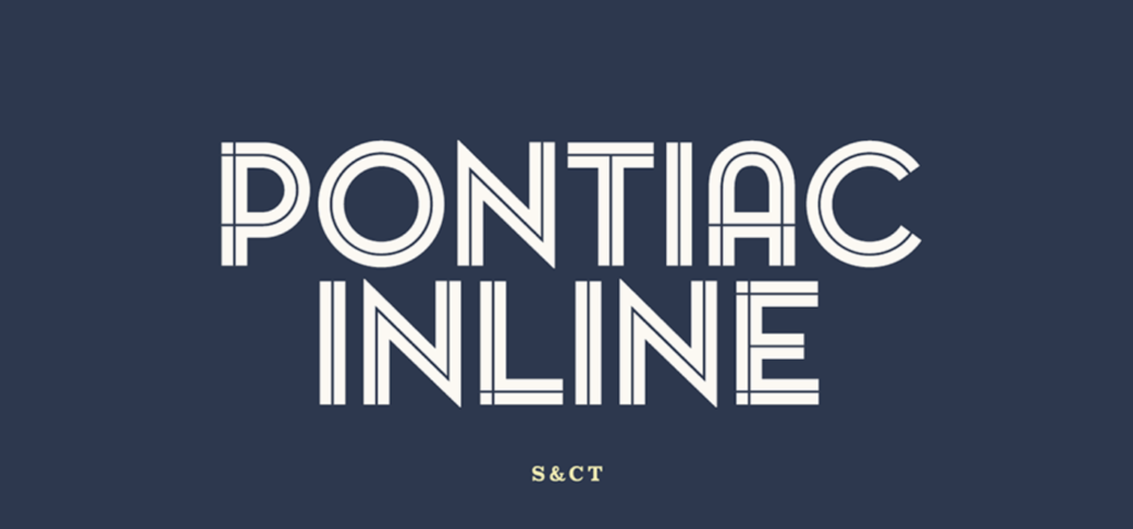
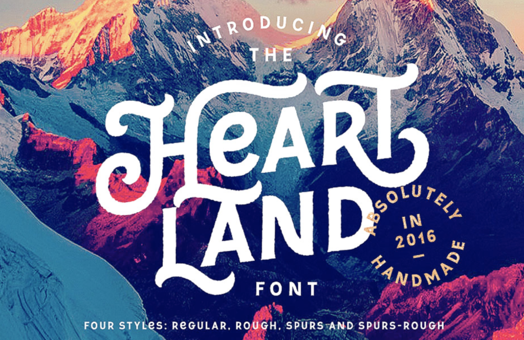
- Or maybe you want something a bit more artistic or creative for your logo? The best fonts for these logos would be something whimsical like Radiant Beauty, Taco Tuesday, Pontiac Inline, Heart Land.
Does your main font pair well with others for use throughout your branding efforts?
Pick complementary fonts to ensure your logo font works well with your content font (if they’re not one and the same, which is okay, too).
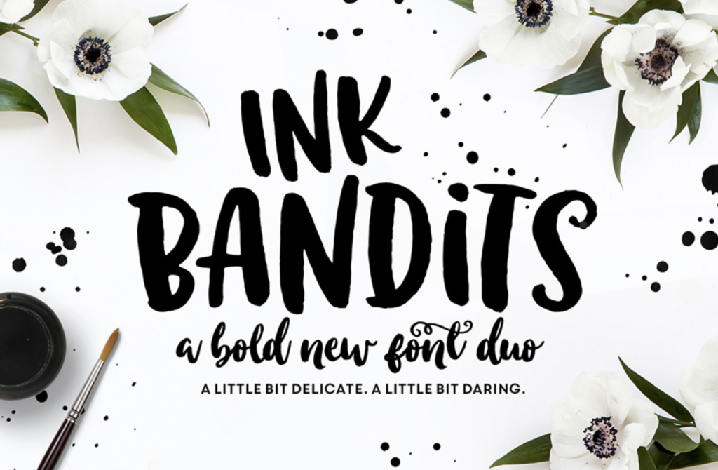
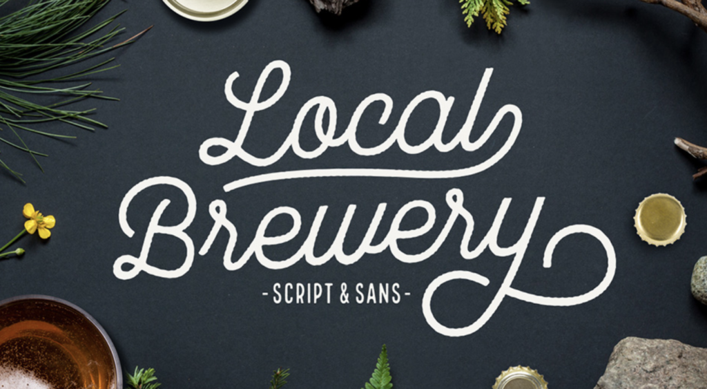
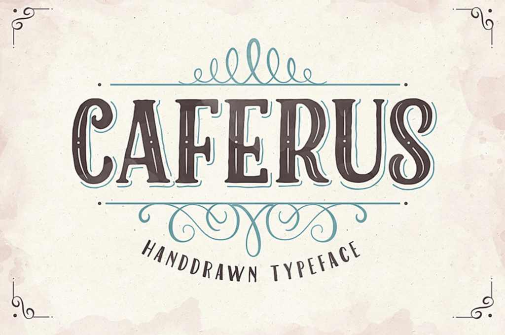
Sometimes, you can also buy fonts that already come paired by the font designer. Examples of these pre-paired, guaranteed-to-look-good-together fonts would be Ink Bandits, Local Brewery, or Caferus. Notice how they each come with at least two different styles of fonts.
Does the font translate well across different media, colors, and sizes?
One of the most ubiquitous fonts to do this is Verdana, which has become as heavily used as it is because it works nearly everywhere.
Will it display well on different software, or is it highly specialized?
Many movie fonts, for example, are so specialized that some sites or programs may automatically render it as a default font (or worse, a line of question marks).
These questions will help you get started on your search for the perfect font. Meanwhile, let’s look at which typefaces are optimal for branding yourself.
Then which are the best fonts for logos?
Even the most creative minds often need a nudge in the right direction when determining the best fonts for logos.
The basics of font psychology are fairly simple:

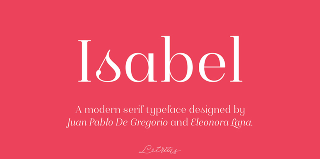
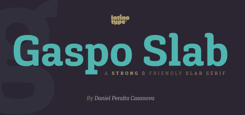
- Serif fonts are classic: we’re talking fonts like Isabel, Gaspo Slab, or Fnord Roman.
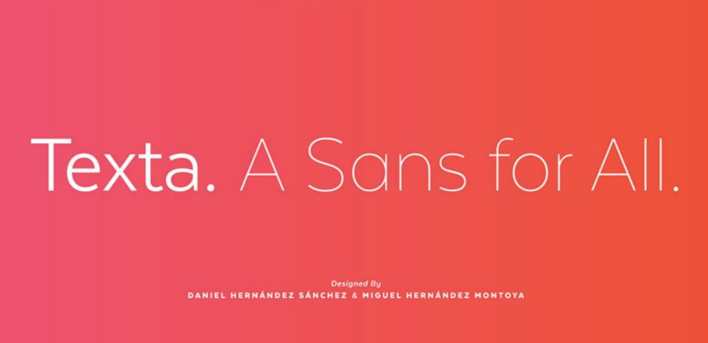
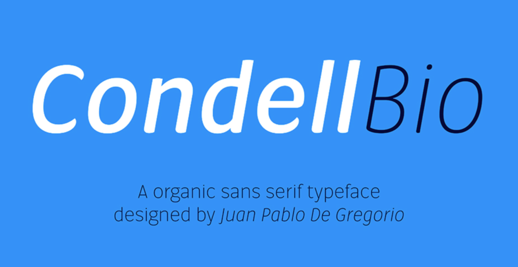
- Sans serifs are more modern. Fonts like Basic Sans Narrow, Texta Font, or Condell Bio will suit a more modern logo.
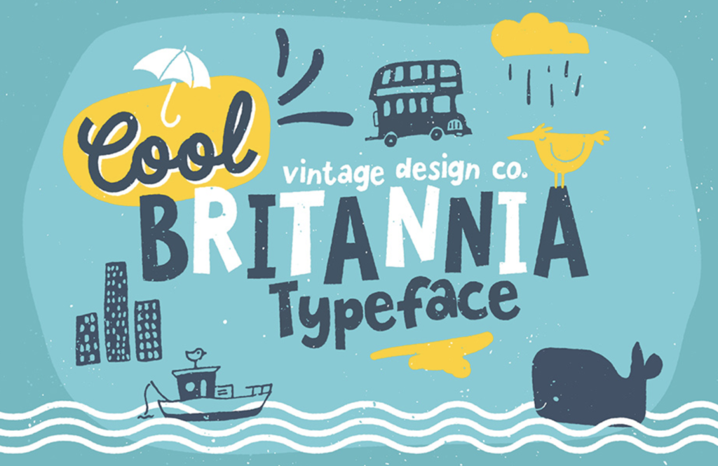
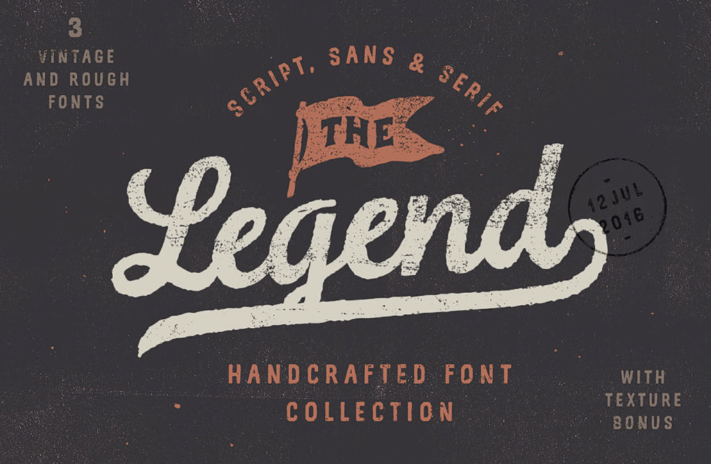
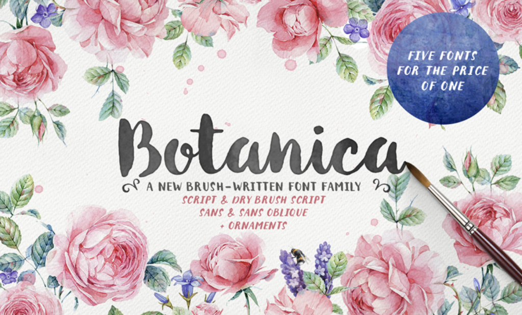
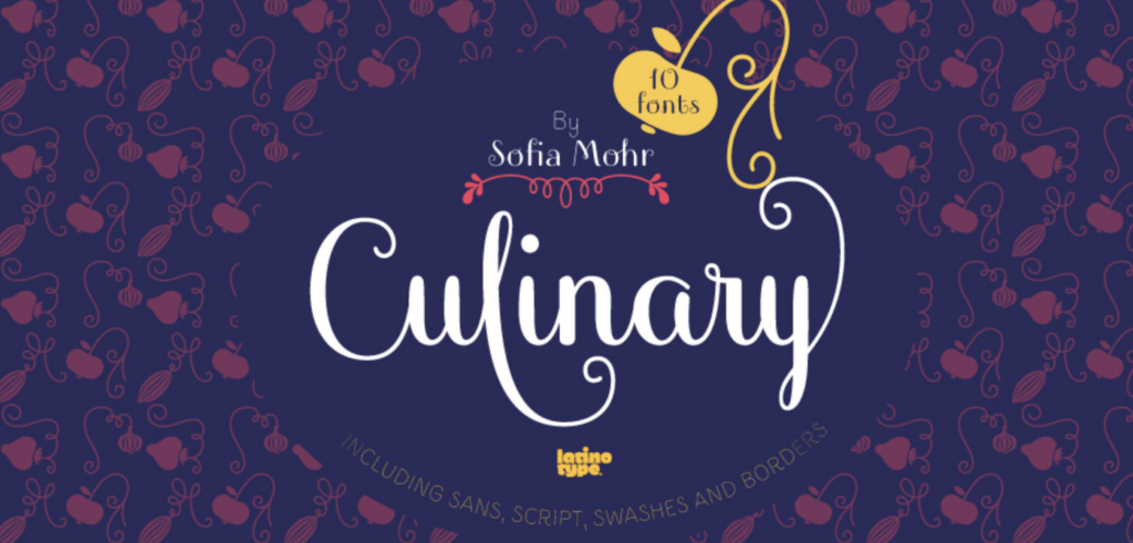
- Handwritten fonts are for a much more creative, organic, or artistic logo. Use fonts like Cool Britannia, The Legend Font, Botanica, or Culinary Script.
Once you’ve picked your font, it’s equally important to stylize it.
See how your font of choice responds to tracking, emphasis, combinations, and scaling, for example. If it looks stretched or awkward when you apply the design modifications you had in mind, you may want to pick another one and compare their responses to your tweaking.
For example, imagine that your business specializes in fancy goods, and you think something delicate (say, Handsome Script) would work well as a headline font. It may look nice in tandem with your other fonts, and it’s easy to read on its own, but one thing is off — maybe its kerning looks unnatural.
Remember, if your logo or branded materials takes effort to read, people will believe doing business with you is similarly draining and complicated (much like your font choice).
How to utilize these tips to find the best font for your logo
Every font has unlimited potential if it’s used in the right application.
When you have found the perfect font for your logo, you show that your business knows what it’s doing.
Consider how well Coca-Cola’s font fits its image of classic Americana (partly due to their tireless marketing of Coke as a quintessentially American beverage).
Or how Apple conveys sleek, sophisticated minimalism by pairing a clean sans serif with unembellished display design.
Shoppers are pleased when a brand’s overall image matches the experience or values.
However, realize when sticking exclusively to one or two fonts is limiting you. Different applications such as:

- web text,
- promotional materials like vinyl decals, and
- collaborations with other companies
will require different looks. It’s best to have a small arsenal of typefaces that you’ve already tested for brand compatibility, so when an opportunity comes up, you already know which font you’re going to use.
Lastly, though creativity feels exciting and gets other people interested in what your brand is about, never underestimate the value of consistency. Over time, every aspect of your appearance — including your typefaces — will become more and more synonymous with your brand.
Are you in the process of searching for a branding font, or thinking about a long-overdue redesign to herald a new season for your business? How did you arrive at the font choice(s) you did when branding your business? What do you think are some of the best fonts for logos?
Why do you believe they’re the perfect fit for you? Share your comments, questions, and stories in the comments!
Keep the conversation going...
Over 10,000 of us are having daily conversations over in our free Facebook group and we'd love to see you there. Join us!






Nice collection, even we have listed some really amazing logo fonts here in this post https://goo.gl/zAwUTw
What are your feelings on mixing fonts, such a the 1st letter, say Cylburn, or Old English (thin, not distracting, slightly larger) then changing to a script, or Sans Serif, or do you not play with fonts like a recipe for vegetables soup?
Thank you, good logical information, makes sense
Great tips thanks!
Great summary of thoughts. Thank you.
Hi there Katherine, great article. I just have a question, what typo did you use for write it.
Thank you in advance. Best.
Thanks Katherine! very useful tips!
Lovely tips! It helped me a lot……
Thanks Katherine!
Was very helpful! Thanks
good tips
Thanks for the mentions!
Thanks so much. Very helpful tips.
love the tips! thanks!
Very great tips