It seems like trends these days come to life and go to the grave in the time it takes to eat a sandwich. Designers have a difficult job of keeping abreast of typography trends and an even more difficult time admitting when their go-to fonts have become overused, and finally, cliché.
While most of the fonts that have gone out of style aren’t necessarily “bad” fonts as people often label them, their overuse has changed our perception of them. Papyrus, Comic Sans and Curlz are just a few examples of popular typefaces that are now ubiquitously seen as unprofessional.
(PS: Our partners and sponsors, Design Cuts, have a killer bundle going for just 5 more days. Over $1,100 worth of fonts for just $39. They didn’t pay us to include them in this post. We just think the bundle is amazing! Check it out for yourself here.)
Here are a few fonts that are overused and may be killing your design plus other fonts to use as replacements that will enhance your message instead of distracting from it.
Money Note: If an extra $1K–$5K/month would change your 2026 goals (debt, savings, travel, freedom), you’ll want to catch this: free live workshop from a freelancer who’s earned $4M+ online. No fluff. No gimmicks. A real roadmap. 👉 Watch the training or save your seat here »
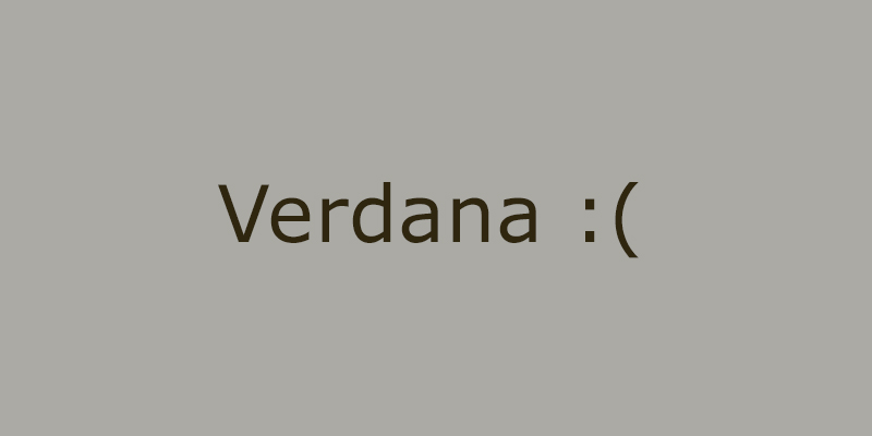
#1 Verdana
Verdana was one of the first typefaces created for on-screen readability. Like Helvetica and Arial, it is somewhat of an all-purpose typeface that has been, well, used for too many purposes. It is available across Mac and Windows systems and is a staple of e-reader devices and reading apps.
Basically, it’s become part of the backdrop for the majority of web users that—despite being functional and user-friendly—doesn’t stand out.
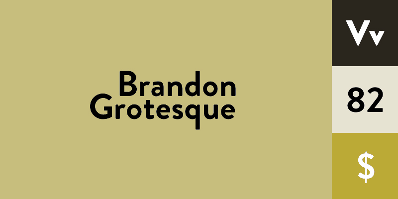
Alternative: Brandon Grotesque
Brandon Grotesque is as user-friendly as Verdana, but has a touch of pleasant personality. It’s elegant and clear, yet expressive, which makes it a great choice for professional yet personalized materials such as business cards or resumes.
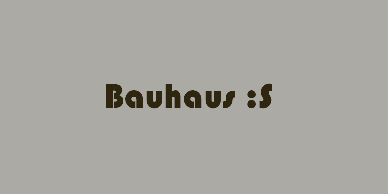
#2 Bauhaus
This curvy, geometric sans serif is both distinctive and practical. It’s based on a design movement that changed typography forever. However, its iconic status doesn’t necessarily work in its favor when it comes to creating a fresh design, since it can be difficult to use Bauhaus in way that looks non-stereotypical or modern.
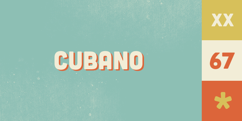
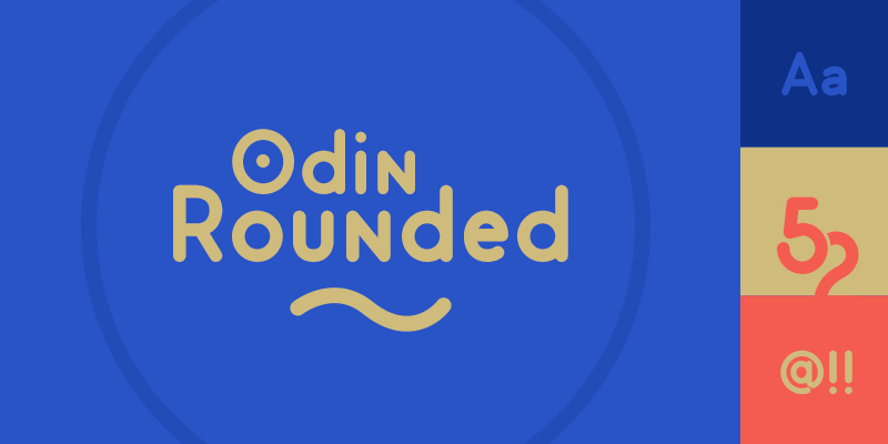
Alternatives: Cubano, Odin Rounded
Cubano and Odin Rounded are similar to Bauhaus in that they are curved and condensed, but clean. Like Bauhaus, Odin Rounded is very distinct with flourishes on certain letters that make it iconic.
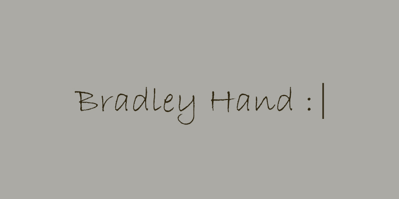
#3 Bradley Hand
For many people, using Bradley Hand is practically an involuntary reflex when it comes to choosing a warm, handwritten font. Many businesses use it in an attempt to seem relatable and human, but it has become such a cliché that it now comes across as cheap and disingenuous.
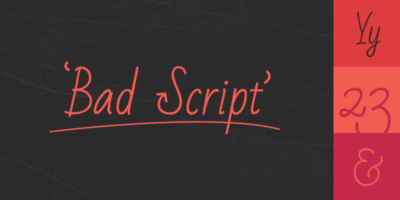
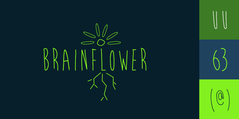
Alternatives: Bad Script, Brainflower
Google’s Bad Script is casual yet smooth, a great replacement for Bradley Hand. If you want to get a little whacky with the handwritten look, Brainflower may be the way to go—although it doesn’t include lower case and will be less functional as body text than Bad Script.
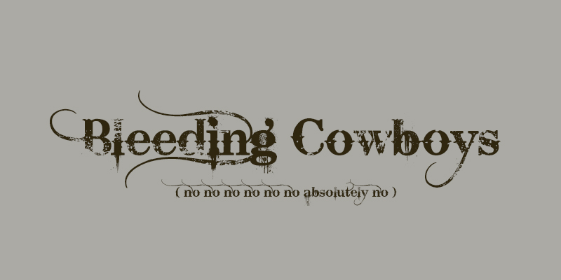
#4 Bleeding Cowboys
This typefaces that has been described as “dirty” and “western” has become a staple of country album art and tattoo parlor logos. It has also inspired a Facebook group of people begging others to stop using it.

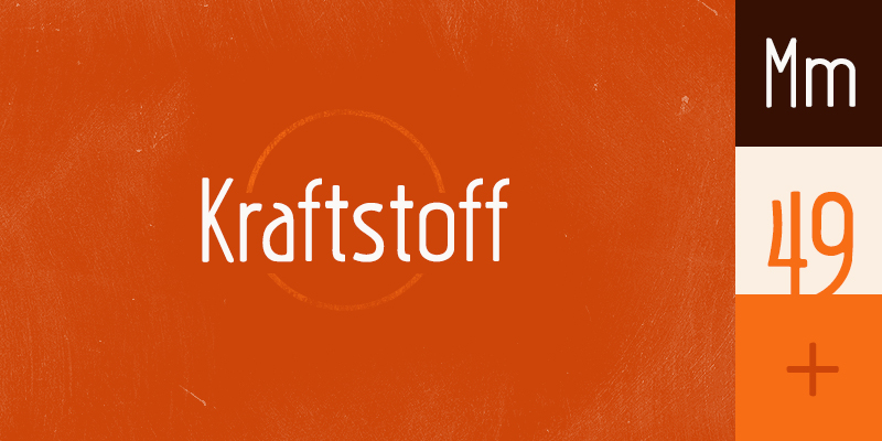
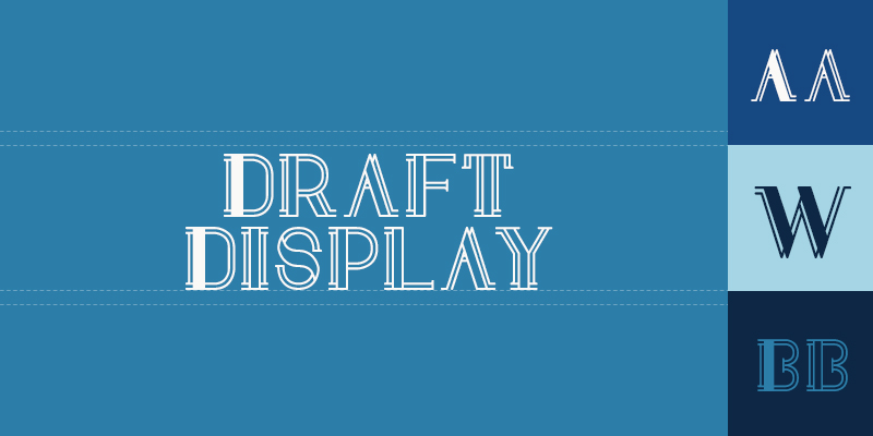
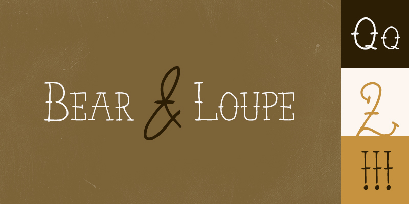
Alternative: Kraftstoff, Draft Display, Bear & Loupe
To tone down the vintage/tough vibe while remaining thematically appropriate, try Kraftstoff, Draft Display, or Bear & Loupe. All three of these feel bold and antique without going overboard.
Like Bleeding Cowboys, Draft Display and Bear & Loupe are ideal for headlines or short bursts of leading text, while Kraftstoff is a little more versatile.
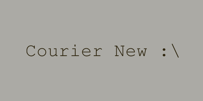
#5 Courier and Courier New
Courier is efficient when readability and clarity are a priority. But it no longer comes across as progressive and modern or even charmingly vintage when it comes to design.
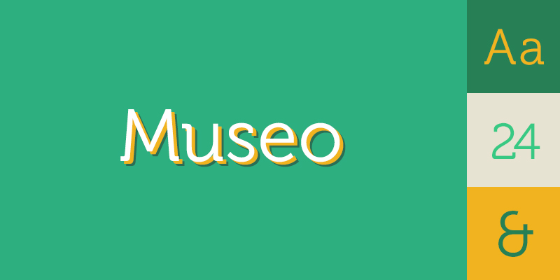
Museo is a versatile semi-slab serif that works for both body text and headlines. Museo, like Courier, is lucid and legible. This serif pairs well with sans serif fonts such as Brandon Grotesque or Trade Gothic.
Bonus: Theme Fonts
Some old-timey or holiday-themed designs call for something special. Rather than the much-maligned Chiller for a Halloween design, go with Feral, Auld Magick or the bold Akura Popo.
For fonts with the feel of Old English but without its reputation, try Epique or Aquiline Two.
Most loved? Most hated? Share with us!
Before you run off to download these typefaces, share with us your favorite (or most hated) font!

Keep the conversation going...
Over 10,000 of us are having daily conversations over in our free Facebook group and we'd love to see you there. Join us!



Brilliant. More articles like this please.
Although the 5 fonts are indeed terrible, the alternatives suggested here have absolutely nothing in common with them and seem like total random choices.
Dude what about “Trajan Pro” my eyes bleed every time I see it.
@Simeon: I’m on vacation, and the other day there was a T-shirt at a local gift shop that I really liked, but I just couldn’t bring myself to purchase it with the Papyrus font. Yes, this may sound uppity to the layman, but there are actually problems with some of these fonts that annoy the heck out of us. Papyrus has horrible kerning issues, and many of these fonts look terrible electronically–hard to read.
But if we are honest, some of our annoyance may stem from the fact that everyone thinks they’re a graphic designer now. People with no taste in good design are creating horrible looking ads and promotional products and taking money from our pockets. Then their friends lie to them and tell them how wonderful their work is.
I can appreciate why designers, and some people who have worked with fonts enough to have made some judgements about them, might not like this or that font. But what are we talking about here really? Isn’t the job of the designer to pick a relevant letterform for the job in front of them? If a designer is making font choices based on their prejudice or what some other designer has said or thinks aren’t they loosing sight of their job, aren’t they now designing for the wrong audience?
Ubiquity of some fonts makes them less likely to be picked, standing out matters, but relevance trumps everything else and if a font that has been used allot can be used in a relevant (hopefully unique) way I would say try it and see what happens.
For those that are tired of Helvetica (and its flavors) I have started to use Open Sans as an alternative. I hope it catches on and they expand it to offer Condensed, Extended, Black and Extra Blac variations that I like using with Helvetica.
I did a post on the ones I hate the most a while back. Comic Sans and Copperplate are the bane of my business. I had a new client show me their example of a contemporary font that they’d like used in the new creative. It was Comic Sans. DOH!
Love your alternatives… Top of my most hated list is JOKERMAN. Then following in this list is Gigi and Giddyup and Lucida Calligraphy and its siblings 🙂 .
My favourite valentine font is Fiolex Girls and for Halloween I would pick Juice.
For simple clean scripts, Tangerine does it for me.
I prefer Kokila and Perpetua over Times New Roman
For handwriting…pen like fonts Jellyka is tops… You get to pick from Jellyka le Grand Saut, Jellyka le Grand Saut Textual, Jellyka CuttyCupcakes, Jellyka Chamboard and Jellyka Saint Andrew’s Queens…
Gara is also nice.
Brilliant. More articles like this please. ^_^
This is all fine, as advice to people who have never studied Graphic Design or Typography or know anything about fonts or the history of font design at all, but please, I thought your suggestions were frankly weak. There are way better alternatives out there without having to spend thousands of dollars.
Love this post … though I was expecting the universally hated Papyrus to make an appearance. I especially appreciate the substitute suggestions. I’ll certainly be sending this post to a few of my more limited clients …
Hands down Comic Sans. When lawyers and accountants use them in their collateral, I just cry.
Couldn’t agree more! When my teacher uses it, I’m just like, “Come on!”