Landing pages are a relatively new type of a page in the web design landscape, that’s for sure. And in general, if you happen to be working with a client who’s just starting their online adventure, chances are they simply don’t know how crucial a landing page can be in defining their success online.
- Is it your place to educate them on the value of landing pages?
- Should you sell them on a couple of templates (or finished landing pages) as part of the site you’re designing for them?
Let’s answer these questions here.
Definitions first
One common misconception circulating around is that a landing page is any page that a visitor might “land” on. But by this definition, every page can be a landing page!
👋 Psst...Have you seen the all-new Feedcoyote yet? They've got a new look, more freelance opportunities, and the best collaboration tool for freelancers! Join over 100,000 fellow freelancers who network, find clients, and grow their business with Feedcoyote. Join for Free »
A better definition that reflects the actual usages of landing pages in modern online business is the following:
A landing page is a single-purpose page. It has only one goal – to capture visitor info, so it needs to have an HTML form on it. However, it also offers something in exchange. No one will leave their info without a direct incentive to do so.
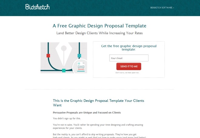
For example, here’s a page from Bidsketch.com offering a free graphic design proposal template:
This page has a very minimal design, a clear headline, an email subscription form, and not too lengthy explanation on why you might want to get the proposal template that’s being offered.
There are no other calls to action, no social media icons, no sidebars, no menus. The landing page has just a single purpose.
The role of a landing page
A good landing page can be a great tool in your client’s online arsenal.
In fact, the whole reason a landing page evolved in the first place was to improve standard web page conversion rates by creating a page that’s optimized purely to achieve just a single goal…capturing visitor info.
The reason landing pages continue to grow in popularity is simply because they work, giving site owners a better ROI for every visitor they get.

That’s something your client will surely be interested in.
So the first selling point is: by using them, they will be able to grow the number of leads or clicks they’re getting every day without increasing their marketing budget (on things like advertising, SEO or some other traffic-getting technique).
Landing pages = win-win
Apart from the obvious fact that you’re doing this for a paycheck, there’s also one more “preventative” benefit to landing pages.
Here’s what I mean: some websites fail. And the worst part is that it isn’t necessarily your fault.
This is where landing pages come into play.
With them, your client’s website is more likely to succeed, thus making them happy with the service you’ve provided…and more likely to be repeat clients.
Principles of a landing page
Okay, I understand this might look like just an additional thing to worry about at first. But in the end, it usually turns out to be one short conversation that brings great results to both of you.
A good place to start is to explain the main principles of a landing page to the client. Feel free to use this cheat-sheet:
Landing pages are meant to provide just one point of action to the visitor.
The page doesn’t let the visitor do anything else other than take the desired action or leave the page entirely.
Landing pages make the desirable action clear.
This is done through a clear form placement and a good “call to action” – a direct invitation to do the thing.
Landing pages are distraction-free.
There are no sidebars, no footer, and just a minimal header. This focuses the visitor’s attention on the action we want them to take.
Landing pages have no social media integration.
Social media plays a huge role in today’s web, but having social media on a landing page is only a distraction and an additional exit point.

Landing pages have minimal design.
Even if the rest of the website is more visual in nature, the landing page should be treated separately and retain only a minimal amount of branding.
Building the landing page
After you have the green light, use whatever method to build the landing page(s) you wish, but consider the following:
Is there just one goal for the whole site, or will they need a number of them over time?
It might be a good idea to prepare a whole custom page template that can be reused in WordPress. Or maybe build the whole site on something like the X theme and let your client in on a pre-made drag ‘n drop template?
Is the main goal to capture visitors’ info straight into an email list?
In this case, you can use one of the available landing page creators based on the email service (GetResponse, MailChimp, Aweber, etc.) the client is using. Using it will be much quicker than developing a page by hand (in HTML) and will also ensure the solution is secure and optimized to work with that newsletter service.
Should the landing page be visible in Google?
It’s worth asking this question. Not all landing pages should be searchable, especially if they can be considered duplicate content by web crawlers. If that’s the case, make sure to put a “noindex” on the page.
Make sure that the visitor info coming from individual landing pages can be distinguished from the other sources.
The whole value of good landing pages is that their results can be evaluated and compared with other channels.
Does the landing page need any additional visual elements and graphics on it (like an infographic, graph, or a presentation)?
Those things usually require a lot of back and forth before everyone’s happy with the final result. For that reason, using an external builder tool might be a good idea (something like Visme). You can easily build the graphic in it, and then once the client enjoys the result, you can fine-tune and produce it in Photoshop if there’s a need.
(In general, if there’s a tool available that can aid you in building the landing page, use it. Doing everything by hand and from the ground up is a short-lived strategy, especially in 2015.)
Conclusion
The topic of landing pages is a huge one, and relatively unknown compared to the other online marketing tools. We’re still learning how to utilize landing pages correctly, how to optimize them, and ultimately, how to grow an online business with them, so it’s only honest to let our clients in on the action, too.
In the end, we should educate clients about landing pages just like we’re educating them about contact forms, website backups, blogging, social media, not installing dangerous plugins, and a ton of other web topics.
But what’s your take? Are you including landing page design as part of your standard web design service? How do you convince your clients on them? Leave a comment with your thoughts.

Keep the conversation going...
Over 10,000 of us are having daily conversations over in our free Facebook group and we'd love to see you there. Join us!


Have you ever considered about including a little bit more than just your articles?
I mean, what you say is important and all. But think of if
you added some great visuals or videos to give your
posts more, “pop”! Your content is excellent but with pics and videos, this website could definitely be one
of the best in its field. Excellent blog!
With so many people have business pages on facebook it would seem that these would be kind of redundant? it doesn’t get much more convenient than having whatever customers need on an app they’re already on daily.
This is really a question I’ve wonder about for some time. I’m afraid that people often do not want to sign up to something, thinking ther mailbox will get full of spam, commersials or other “crap”. So my fear is that one can loose prospects by using this approach. But I do try it myself thru Aweber. Let’s see how it turns out 🙂
Great article Karol. In maintaining clients PPC campaigns, you really come to see the value & importance of a well executed landing page. However communicating the necessity and purpose of their scaled down design can be challenging. This is why A/B testing is so important too!
By my observations, it seems like folks have an element of “separation anxiety” that if there isn’t a full main/navigation, footer etc etc that it is incorrect. I am truly dealing with this issue now…
Thanks! You’re right about the value of landing pages for PPC, it’s the one area where we get raw numbers regarding the page’s quality.
Communicating the purpose of the landing page can be tough indeed. Even though web design is a rather niche topic, most people know the basic elements – like menus or footers – and they will have questions if they don’t see them on the page.
Thank you for this article! I am currently working on relaunching my business and was initially looking into creating a one page “launching soon” page. This article gave me so much more insight and value as to what I can effectively do NOW! I am new to web design in terms of creating one myself so I am working on the look and functionality and I will teach myself how to create it. But in the meantime I will begin here. Also check out onepagelove.com I believe they sell templates but they don’t call them “landing pages”.
Kimberly,
Great take from this! I never thought about it, but when a client is getting their site up (even me as my own client!), that’s a perfect opportunity to put up a landing page gathering email subscriptions until the new site is ready!!!
Thanks!
April
I’m glad you find the advice helpful! When you’re just getting started, remember to keep things simple. It’s way too easy to overdo things with landing pages, up to a point where the visitors can no longer understand what the page is for.
So I get the point of landing pages. How do we go from the creation phase to being sure the right people are seeing them?
That’s all in the promotion of the pages. Basically, a landing page works if you share it in the right place. For instance, setting up landing pages for your guest posts is a good idea. That way you can welcome the people coming in and give them specific info based on the site they’re coming from.
I was just listening to a podcast about this exact topic. I would love to create an incentive + landing page to get more email subscribers, however, I’m having trouble figuring out what would be a worthwhile incentive (for me and for them!). Any suggestions?
There are two possible paths here. If your audience is big enough, you can simply ask them via email or on your site in the form of a blog post. Then gather the answers, look for patterns and try to identify the issues that you can solve.
Another approach is to steal some ideas from other sites in your niche. Look what’s getting popular. Try building something that’s even better.