Have you ever updated your Adobe Design Suite but been too busy to really investigate the new features?
You keep ploughing along, using the tools the way you’ve always done until they change something that requires you to learn the “new way,” promising yourself the whole time that you’ll figure out what you’ve been missing when you “get around to it.”
Sound familiar?
(This happens to me ALL the time.)
👀 The way clients search for freelancers has changed — stay visible across Google, ChatGPT, and AI platforms with Semrush One and land your next freelance client. Click here to see what you’re missing »
So curiosity finally got the best of me, and I recently discovered some great Illustrator updates.
Adopting them has made me a speedier, more precise designer…awesome!
Here’s my favorite (at long last!):
Video created as part of Webucator’s Illustrator Courses.
Easy text box resizing in Illustrator
(This is similar to “Fit Frame to Content” in InDesign.)
I’ve groused about this issue in Illustrator for a long time, but no more.
As of CC 2014.1, finally, there’s a quick and easy way to do just that!
Here’s how:
Step 1
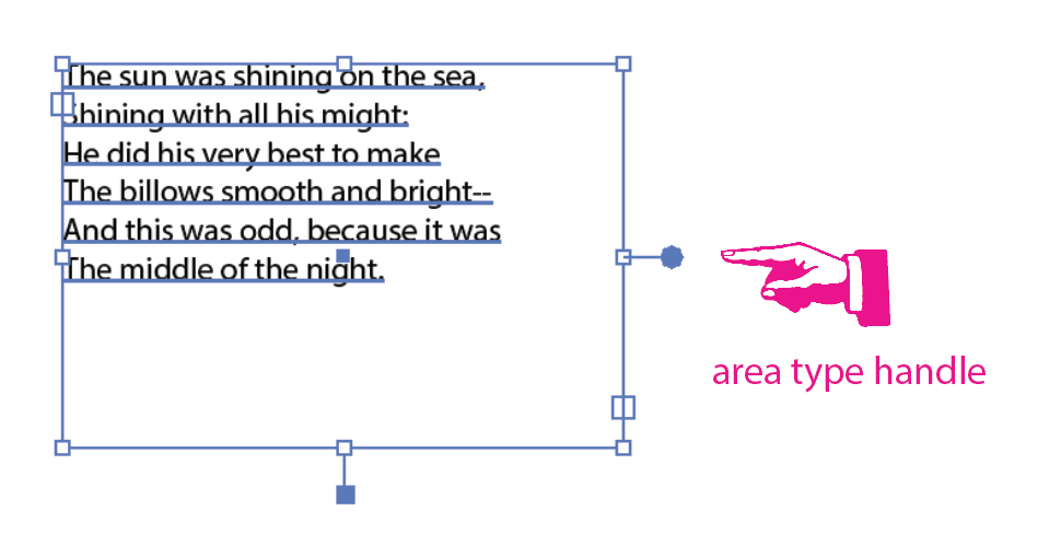
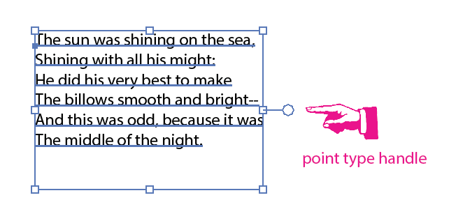
Make sure you’re working with area type, not point type, using Illustrator’s new better visual clues as to what kind of type you’re working with.
Using the selection tool (V), click on the text box and notice the new handles at the bottom and right sides of the text box.
If they’re colored in, the type is area type.
NOTE: Be sure you’re using the selection tool, and not the direct selection or group selection tools – these handles only appear with the selection tool.

Area type (solid handles) is:
- type you’ve inserted into a shape
- when you use your type tool to click/drag a box and then insert type
- best for larger amounts of text
Point type (“empty” handles) is:
- “rogue” type that is unbounded by a text box
- when you select your type tool, click on a spot in your layout and begin to type
- okay for text boxes with very few words
Step 2
Hover your cursor over the handle at the bottom of the text box, and you’ll see a pop-up icon that looks like a little text box with an up/down arrow at the bottom.
I call this the window shade icon, but Adobe probably has a highly technical name for it.
Double-click on this window shade icon, and witness the majesty – the text box resizes to the content!
Warning: You can only do this with the bottom handle, remember.
If you attempt this with the right-side handle, you’ll convert the type to point type, and when you resize the text box, you’ll distort the heck out of the type.
(If this is your goal, go for it, but 99.9% of the time, I’m not seeking to distort my type.) 😉
Bonus!
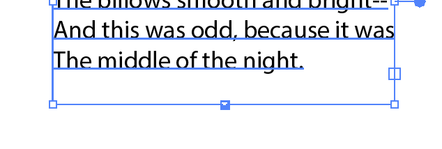
Now that your text box is only as large as the text inside it, have a close look at the bottom of the text box.
It should now have a tiny little downward-pointing arrow where the handle was previously.

This little arrow means that the text box will now automatically size to fit the text you insert or delete.
How handy!
A word from the wise: This magic only lasts until you manually resize the text box or until you flow the text. Then the fun is all over and you have the solid handles back that indicate an area type box.
Set it as default
Want to always default to auto-sized area text boxes?
Go to Illustrator > Preferences > Type and check the box called “Auto Size New Area Type.”
But wait, there’s more!
You can also see the status of your type in the Type drop-down menu.
With an area text box selected, go to Type > Area Type Options. “Auto Size” in the bottom left will be checked or unchecked.
In addition, you can also now use the selection tool to click any open point around the edge of the text box and resize the box with the usual object resizing options:
- resize freely,
- constrain the proportions of the text box with click + shift + drag, or
- resize the text box while keeping it locked to its current center point with click + option + drag.
Why do I like this update so much?
For one thing, it has already saved me a ton of time painstakingly resizing text boxes in Illustrator.
For another thing, easier text box management prevents Tangled Text Box Syndrome. (If you have a bunch of droopy, overlapping text boxes you’re going to continually select them by mistake – very annoying.)
And the addition of this new feature makes this the perfect time to understand the difference between area type and point type, which is always beneficial, especially to newer Illustrator users.
Finally, being able to distinguish between area and point type at a glance will hopefully save you some pain and heartache.
Until next time…
This was a pretty in-depth tip, so I’ll save the others for next time.
If you just can’t wait, check out these posts with other awesome Adobe Suite tips:
- 6 Super-useful Adobe Illustrator tips & tricks
- Simple InDesign tricks to speed up your workflow (and get you paid faster)
But please leave a comment if you are excited about any new features in Illustrator – I’ll be back soon with some of my other new favorites!
Keep the conversation going...
Over 10,000 of us are having daily conversations over in our free Facebook group and we'd love to see you there. Join us!


OMG I LOVE YOU FOREVER FOR THIS!!!! <3
this just saved me so much time!
It’s a great time-saver! I hope Illustrator keeps developing refinements like this…
Thanks for the comment, Grace!
Finally! I agree with other commenters though. Illustrator still needs a lot of improvement. Because my workplace uses the Adobe CC I don’t have my beloved CorelDraw there… To avoid using Illustrator for some simpler stuff, unless I really really have to, I use Inkscape, a really nice little alternative considering it’s FREE.
Interesting article, I learned something new! I just started using Adobe CC and am guilty of doing things the way I’ve always done them. Yes, I, too, will learn the new features “when I get around to it.” hahaa. Thank for this tip, will definitely come in handy to keep my artwork tidy.
Thanks for the note, Jerome! I’m glad that tip was helpful to you 🙂
“Maybe Adobe is listening…”
Yeah, good luck with that! Your article demonstrates why Illustrator is such a piece of cr*p that the only way Adobe could achieve market dominance in the vector graphics field was to lock away (i.e. buy and eliminate from the market) the only credible Mac-based alternative (Macromedia Freehand).
So we’re left with a second-rate product that works like a very early version of Freehand (I’m talking 1991 here — and that’s being generous). Illustrator has been slow to evolve since 1995, it shouldn’t have even survived. In fact it owes its survival to two things; it comes bundled as part of Adobe’s creative suite (sounds like a Microsoft tactic?) and Adobe’s market dominance.
I would agree that Corel Draw is probably streets ahead of Illustrator (or Ill-frustrator as I prefer to call it) but Adobe obviously doesn’t see it as ‘serious competition’. Or else they would actually be improving each subsequent version of Illustrator. I’ve used Creative Cloud versions and they are all as bad as the CS4 version I normally run. Obviously when you are the major player in the market what’s the point in developing your product any further?
Stay tuned, Mike – I’m going to reach out to Adobe and direct them to your comment (as well as the ones of the other Corel supporters that have weighed in…)
Illustrator still has a very long way to go until it approaches CorelDraw. I remember this feature 10 years ago. Yep. However like most creatives, I use Illustrator as it comes with the Adobe package As I also do CAD etc, I use a PC not a Mac. The new Adobe Cloud CC versions of Illustrator on a PC are very problematic. Constant crashes, constant short cut key failure, constant ignoring of so called new fangled added bits and pieces. This is why I ignore the updates and what is new. What is new rarely works consistently on a PC. You have to wait a while, and sometimes you miss out.
Yep, I’ve experienced some glitchy behavior in Illustrator CC, also. I’m Mac-based, so it’s interesting to hear that it’s a similar experience with PC users. And it’s good to hear from the CorelDraw fan base – I’m all embedded in Adobe, so I like to get the alternate perspective. Thanks for the comment!
Good to know this technique in AI however CoreDRAW has lots more to offer when it comes to text editing.
Thanks for the word from another loyal CorelDraw user, Tanvir. Maybe Adobe is listening and will take some steps to bridge that gap!